Fall invitations run from a flat-printed card to laser cut paper, clear acrylic and a vellum wrap, and the price climbs with every envelope liner, embossed finish or hand step you add.
Your guest count decides which one fits, because a vellum wrap, a pocket folder or a liner each add handwork to every single envelope.
Spend on one showpiece, whether that’s the laser cut layer, the acrylic card or the liner, and keep the rest of the suite plain; the sending timeline will set your schedule from there.
1. Fall Foliage
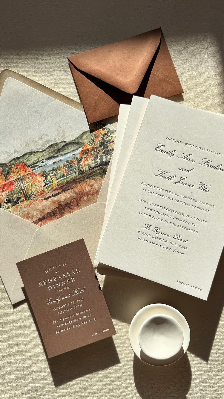
A watercolor mountain scene in autumn colors does its best work when it isn’t confined to the card face. Here it lines the envelope, so the painting appears the moment the flap opens.
A liner is a smart place to spend on art, since the invitation itself can stay simple. Pair it with a plain brown outer envelope and let the painting carry the season.
If the rehearsal dinner card goes in the same suite, repeat the foliage art on it so the pieces read as a set.
When it comes to fall wedding planning, there’s nothing as charming as seasonal stationery. The rich autumn palettes and whimsical fall foliage make for striking designs that are sure to score you an RSVP.
2. Watercolor Card with a Vintage Seal
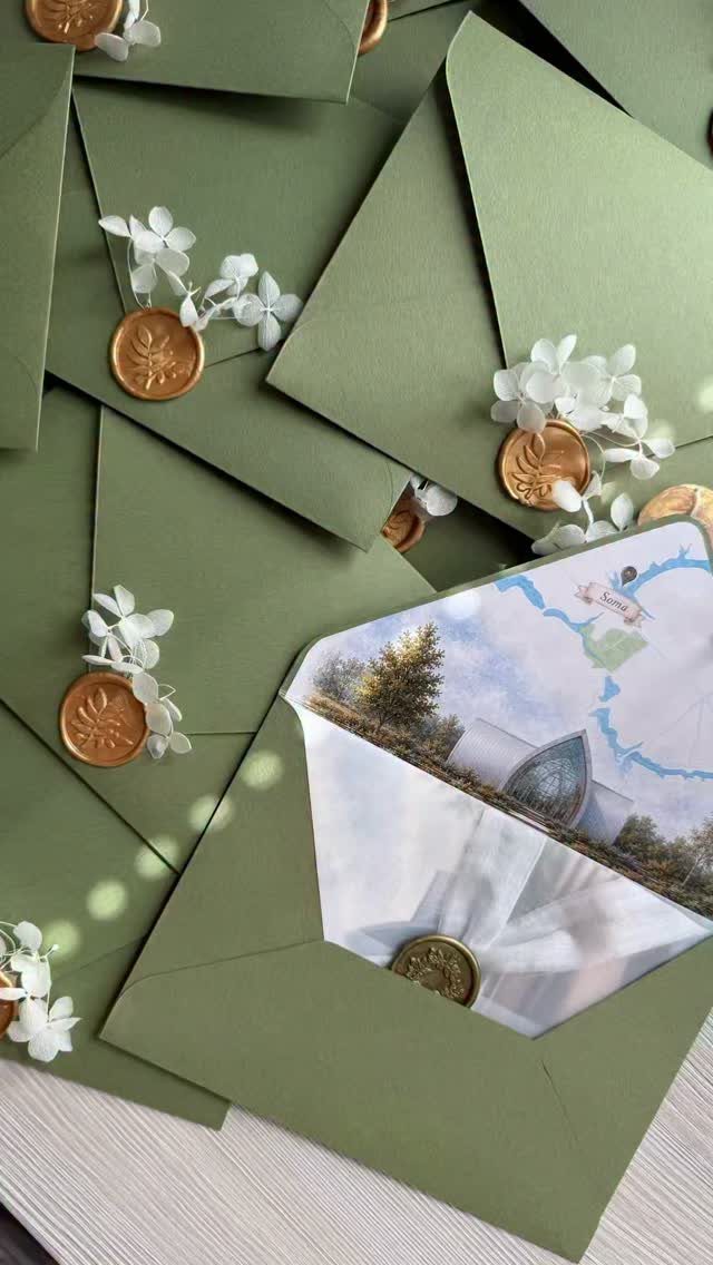
Gold wax and olive green make a quiet pairing, and I would pick them over loud autumn orange for a couple who want something that feels old-fashioned. The seal gives the envelope a finished look before anyone reads a word.
Put the personality inside. A small watercolor illustration of the venue building tells guests where they’re headed before they read the address.
Seals add a hand step to every envelope, so count your guest list before committing to them.
3. Leafy Burgundy
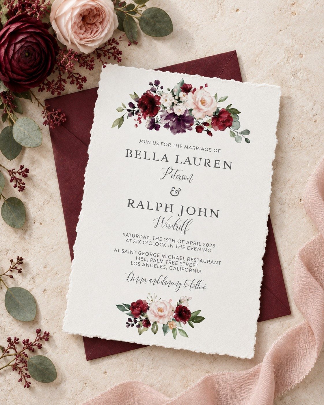
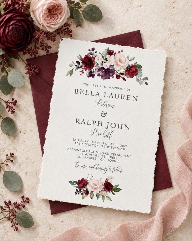
Burgundy proves an autumn invitation doesn’t need orange. Deep red leafy illustrations read as fall without leaning on pumpkin cliché, and they suit couples who want something moodier.
Match the envelope to the card, as this one does, so the color feels deliberate rather than accidental. A pink ribbon softens all that darkness, and a few real flowers on top add texture for photos.
Ribbon and fresh flowers are cheap extras, so save the spending for the printing.
4. Orange Florals
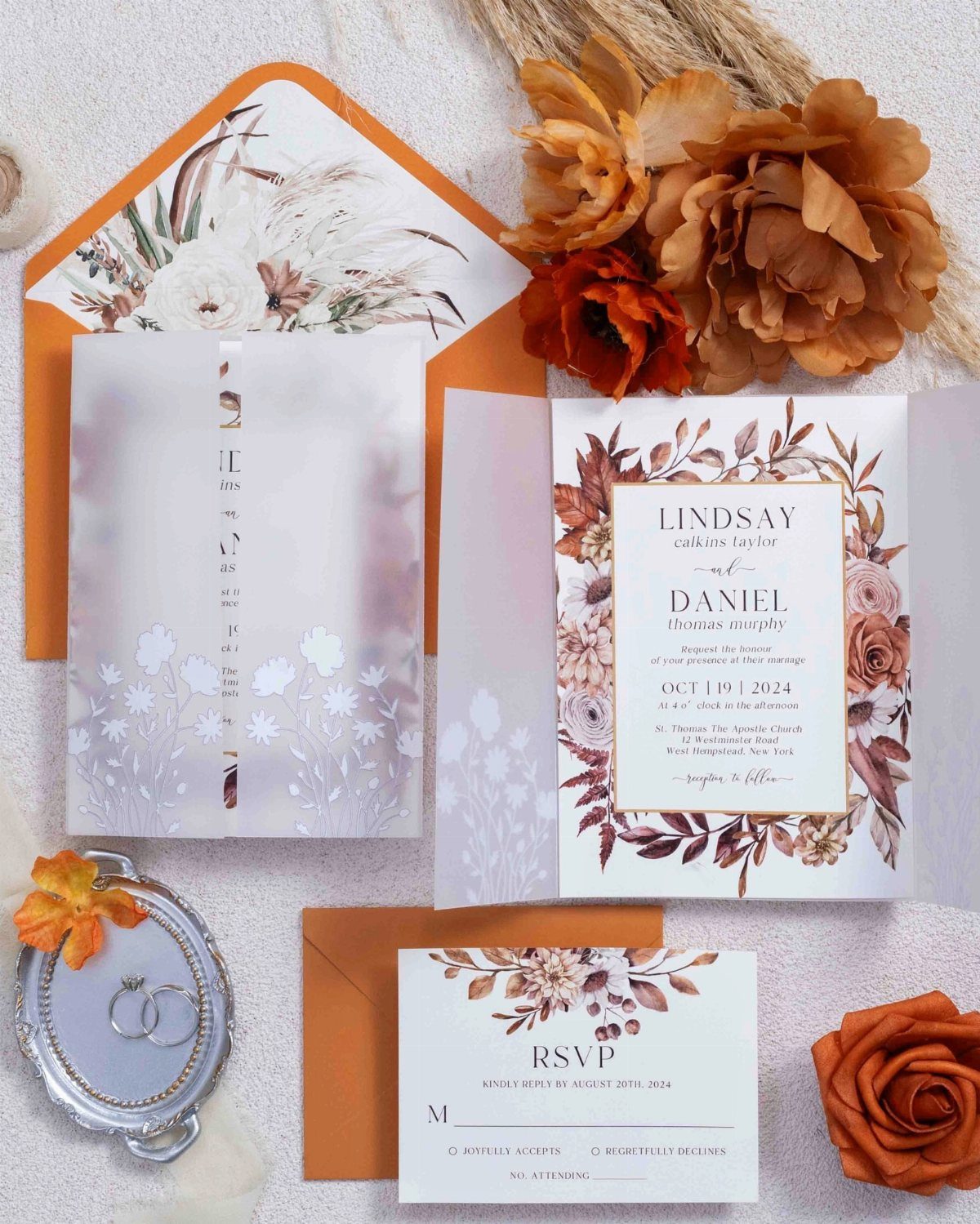
Orange envelopes announce the season before anyone opens them, and floral illustrations keep that boldness from feeling harsh. The rustic charm comes from the mix: bright paper outside, soft flowers within.
A vellum wrap, as in this suite, layers a translucent sheet over the card for a little mystery at low cost. I like it more than extra inserts.
Keep the RSVP card in the same orange family so the whole suite reads as one piece.
5. Jewel Tones with Clean Layouts
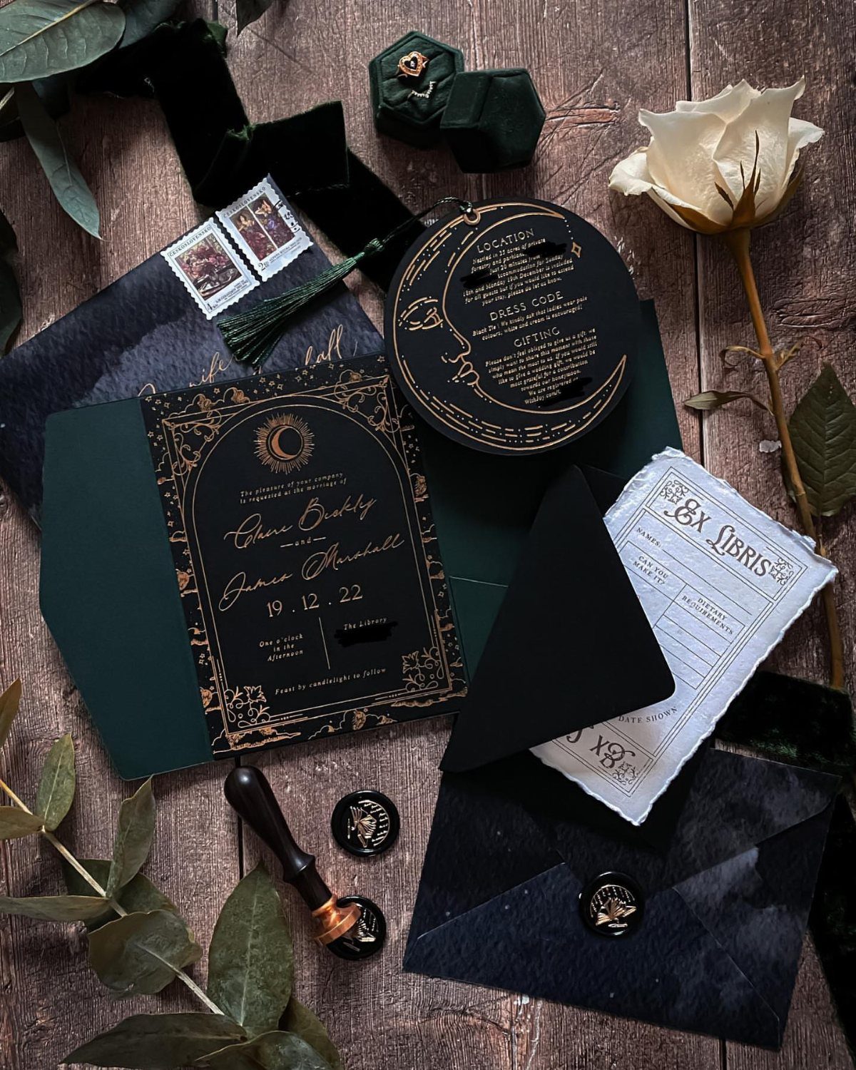
Dark green and black with gold foil look formal without feeling stuffy, and a clean layout keeps the richness from becoming heavy. Leave generous empty space around the names and let the foil do the talking.
Wax seals in a matching tone tie the envelope to the card. Foil costs more than flat printing, so I would use it on the names or a border and keep the rest plain.
Check that the date is easy to read in gold against the dark ground.
6. Laser Cut
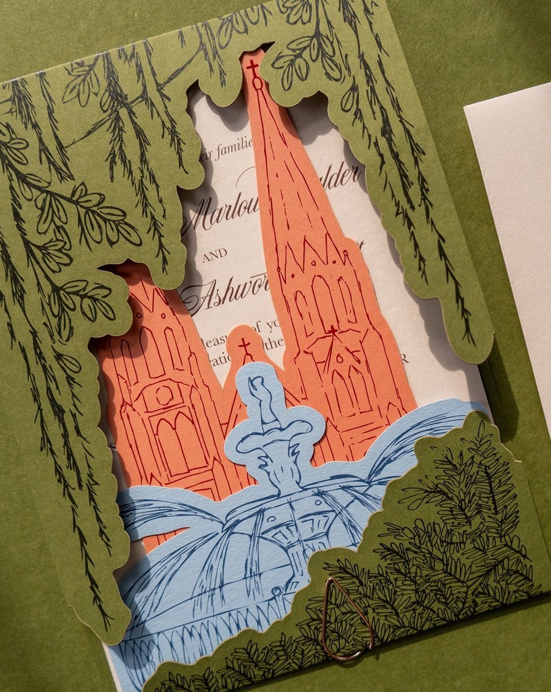
Laser cutting turns paper into lace, and a layered version can set a green leaf border over an illustrated scene.
Cutting lets you choose the shapes yourself, so a church, a fountain or a venue landmark can become part of the design.
Intricate cutting runs well above the price of flat printing, so I’d spend it on the main invitation and keep the inserts plain.
Ask for a sample before ordering the full run, since fine cuts are easier to judge in hand than on screen.
7. Acrylic Invitations
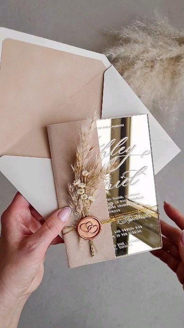
Gold acrylic gives an invitation a modern edge, and a wax seal with a few strands of dried grass pulls it back toward autumn.
The grass is the part I like best, since it costs very little and warms up all that glassy shine.
Acrylic is a splurge next to paper, so I would make it the main card and keep the other pieces simple.
8. Vellum Wrap
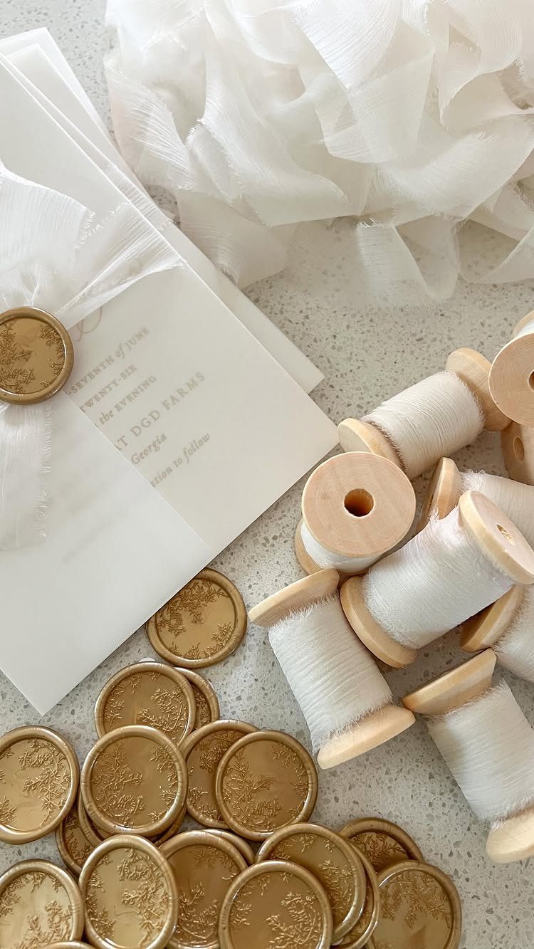
A translucent vellum wrap gives a white invitation a soft, veiled look, and a gold wax seal holds it closed. Because the wrap is see-through, the names and the date peek out before anyone unties anything.
Thread is the other quiet detail here. White cord keeps the palette pale and lets the venue name and the "SEVENTH of JUNE" style date stay the focus.
Print on the card, not the vellum, unless you have tested how the ink behaves on it.
9. Envelope Liners
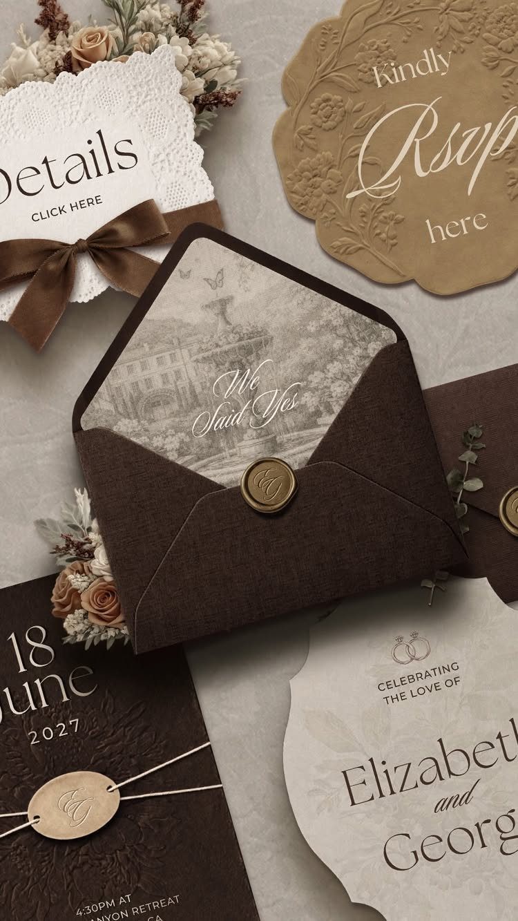
Dark brown envelopes are a good reason to spend on the inside. A printed landscape liner turns a plain flap into a small reveal, and gold wax seals keep the outside looking calm.
I would choose a liner over extra inserts every time, because one printed sheet does more than another loose card. Keep the "Details" and "RSVP here" cards plain so the liner is the one place with color.
Check that the liner pattern doesn’t compete with the names.
10. Deckle Edge with Vintage Accents
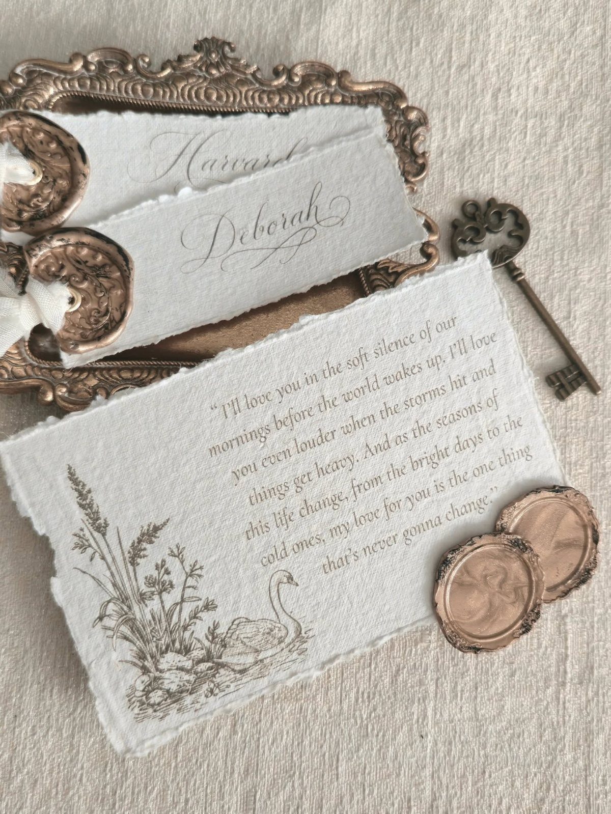
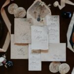
Torn, deckle-edged paper looks handmade because the edge is uneven on purpose. With calligraphy and a short poem, the cards feel personal in a way a crisp rectangle rarely does.
Bronze wax seals suit the rougher paper better than shiny ones, and I like the ornate vintage key as a styling prop for photos. It won’t go in the mail, so keep it for the flat lay.
Handmade edges mean slight variation from card to card, which is part of the charm.
11. Olive Green Pocket Folder
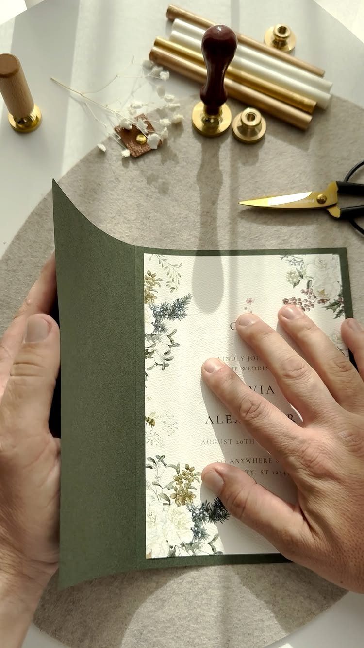
An olive green pocket folder holds a floral invitation like a small portfolio, and the earthy color reads as fall without any orange. Guests slide the card out, so the florals get a quiet moment of their own.
Wax seals and a stamp can close the folder, though each one is a hand step, so count your guest list first. I would choose the folder over a boxed set; it feels richer and takes less room.
Print the date, such as "AUGUST 20TH," where it shows when the card is half out.
12. Embossed Monochromatic Envelopes
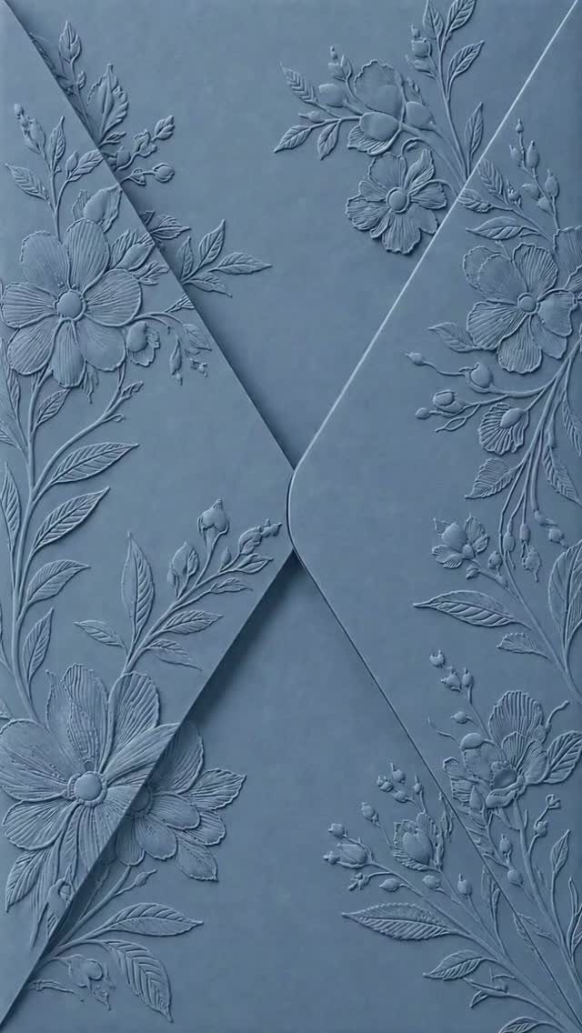
Embossing makes the design something you feel as well as see. A dusty blue envelope pressed all over with raised flowers and botanicals needs no ink, so the color stays one calm shade.
Because the texture does the decorating, I would keep the card inside simple. Dusty blue is a cooler pick than most fall suites, and I like that.
Raised patterns flatten out on a screen, so order a sample and run a finger over the embossing before you commit to a full set.
Choosing the Right Design
Start with color, because it decides everything else on the suite. Deep reds, oranges and browns read as fall right away, and a metallic accent keeps them from looking rustic in a way you didn’t intend.
Emerald, navy and plum jewel tones give an invitation a moodier, more dramatic look. Copper, bronze or gold foil gives them a hint of shine.
Pick one metallic and stick with it. 2 competing finishes on the same suite look like indecision, and each extra finish usually adds to the printing bill.
If your guest list is tiny or many people are traveling, a digital or animated invitation is worth a look. Digital invitations make RSVPs easy to collect and cost less than printing, which suits a small budget.
Wording for Invitations
Warm, intimate wording suits fall, and a single seasonal image is enough.
A single line about falling leaves, a harvest moon or autumn’s golden light is enough to set the mood. Three of them in one invitation gets syrupy.
Put the poetry in the opening lines and keep the logistics plain. Guests should find the date, time and place without decoding a metaphor.
Try writing your line out loud.
If it sounds like something you’d say to your guests, keep it. If you’d never say it in person, cut it.
Also keep the wording short. A brief, warm phrase fits on the card with room to breathe.
Sending Invitations
Mail invitations 8–12 weeks ahead of the big day. If the date falls near Thanksgiving or another major holiday, lean toward the early end or go earlier still, since people book travel and family plans fast.
Set your RSVP deadline 4–6 weeks before the wedding. That gives you time to finalize the seating chart and the catering count without chasing late replies.
If you’re planning a destination wedding, or many guests have to travel, mail save the dates 6–8 months out. If most of your guests live nearby, you can be more relaxed about it.
Work backward from the wedding date and put each of these on your calendar now, before the printing and addressing eat your schedule.
Frequently Asked Questions
What are some good gift ideas for an invitation?
Skip a gift and put the money into one standout detail on the invitation itself.
Small extras like a printed envelope liner, a gold wax seal, or a few stems of dried grass laid across the top add real polish for very little money.
Dried grass in particular warms up a glassy acrylic card and keeps the look tied to autumn.
What are some good themes for a fall wedding?
Rustic, elegant and intimate themes all fit the season. For an elegant look, deep reds, warm browns and jewel tones such as emerald, navy and plum work well, with a touch of gold, copper or bronze for shine.
Choose a single metallic for the whole suite; mixing gold and copper, say, reads as a decision you could not make.
When should invites be sent out for an October wedding?
Mail them 8–12 weeks before the wedding. Near Thanksgiving or another big holiday, mail on the early side or even sooner, because guests book flights and family plans quickly.
Ask for replies about 4–6 weeks ahead of the date, which leaves room to finalize seating and give the caterer a headcount.
What are the different types of wedding invitations?
The main choices are printed, digital and animated invitations. Printed suites can use finishes like foil, embossing, laser cutting, acrylic, vellum wraps or deckle-edged paper.
A digital or animated invitation suits a tiny guest list or many traveling guests, since it makes RSVPs easy to collect and costs less than printing.