Which of these ideas fits depends on how much of the jewel tone look you can put on the invitations and how much has to come from cheaper places like bridesmaid dresses, floral arrangements and table decor.
If the budget is tight, spend on the pieces guests handle and see first, such as foil on the names and border or a dark cloth under purple and pink flowers, and keep the rest plain.
1. Mismatched Bridesmaid Dresses
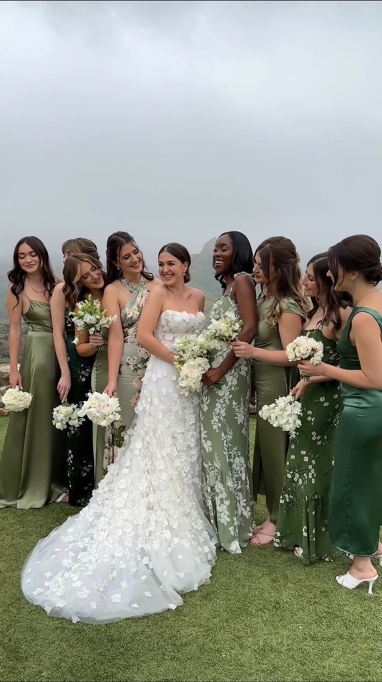
Mismatched greens in one lineup let you bring several jewel tones into a wedding without matching anyone. Emerald, deep teal and forest can sit side by side because they share a color family, so the group reads as one palette.
Pick the family first, then let each bridesmaid choose her own shade and cut. That keeps the cost down for people paying for their own dress, and it saves you from one silhouette that flatters only a few.
Match the stationery to the darkest green in the group, and the invitations will feel tied to the dresses.
2. Jewel Tone Wedding Invitations with Gold Accents
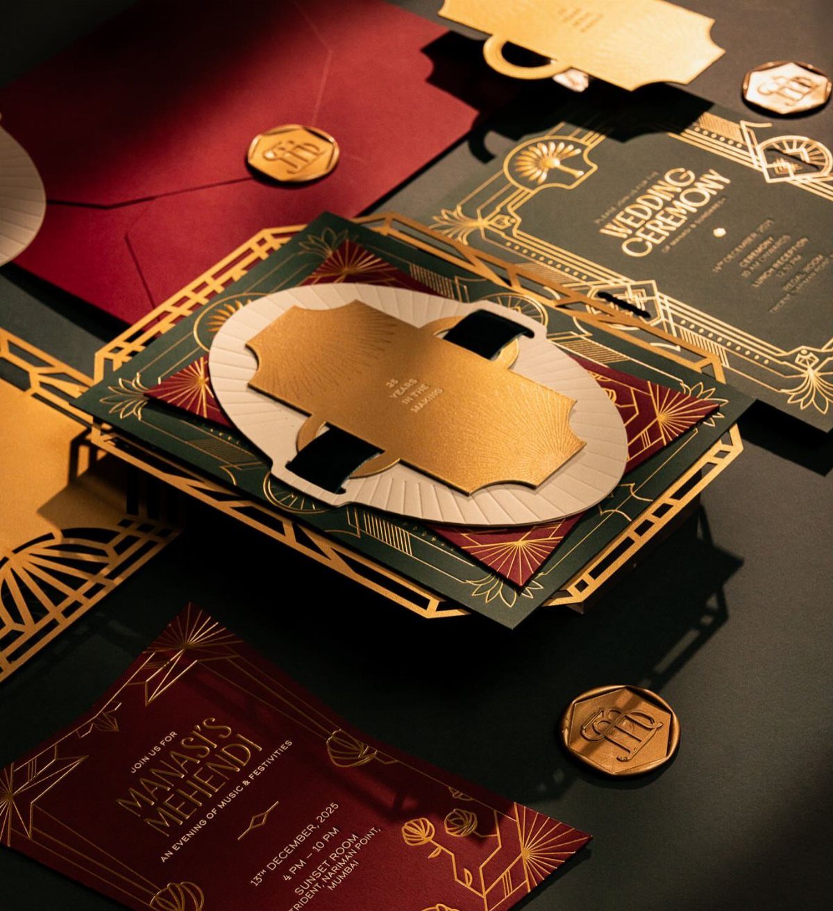
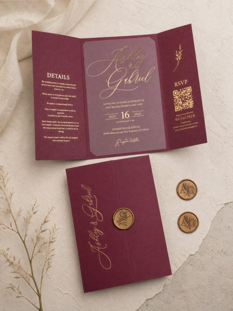
Gold foil is one way I know to make two heavy colors look deliberate. On emerald and burgundy stock, it adds contrast that flat ink can’t, and geometric patterns keep the look modern rather than ornate.
Wax seals are a fine finishing touch, but price them before you commit, since each one is a step done by hand.
If the budget is tight, I would put foil on the names and the border only and print everything else in plain ink.
Foil on dark paper can look very different on screen.
3. Floral Arrangements
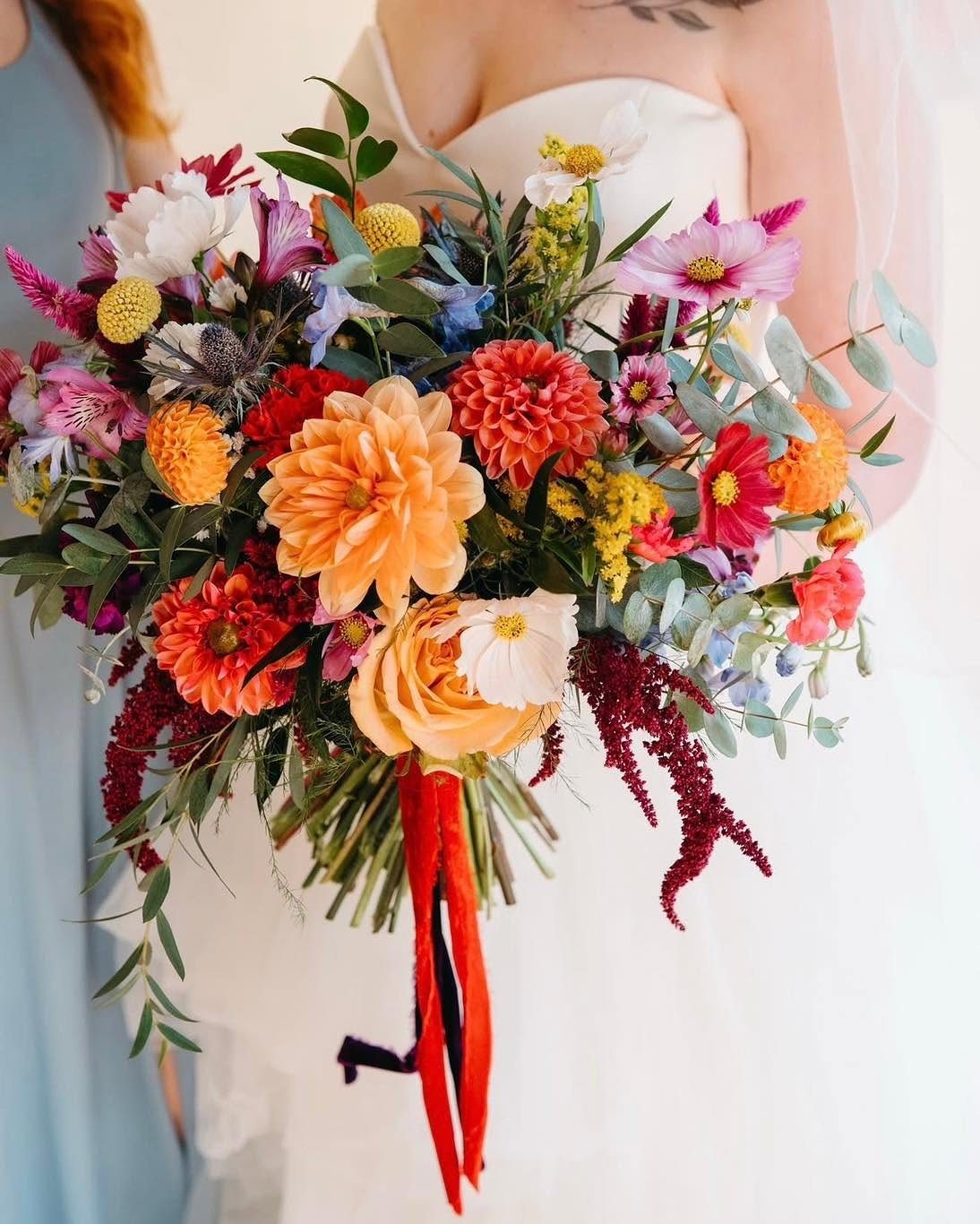
Dahlias and zinnias carry saturated color on their own, so a bouquet built from them needs very little help.
Orange and red against a white dress stand out, and you can repeat the same blooms in the ceremony and reception arrangements.
I like a single ribbon color rather than a mix; it keeps a loud bouquet from looking busy.
Ask your florist what is in season for your date. Bold blooms cost less when they are in season, and that matters on a real budget.
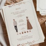
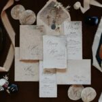
4. Jewel Tone Wedding Invitations with Vintage Florals
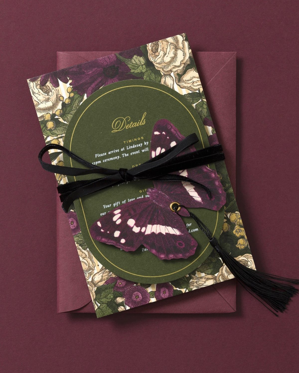
A dark purple envelope with a green card inside gives you 2 jewel tones before anyone reads a word. Vintage floral borders soften that depth, so the suite feels romantic rather than heavy.
I would stop there, because more trims on a patterned card quickly crowd it.
Keep the details and timings in plain, readable type on the card. Busy borders already do the decorating, so the wording should stay simple.
5. Table Decor
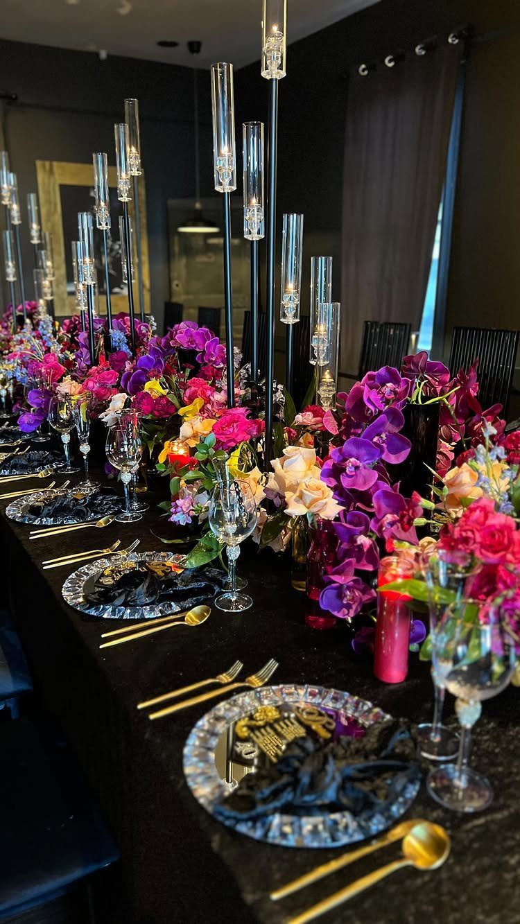
Black linens make jewel tones glow, and that is why this table works. Purple and pink flowers look richer against a dark cloth than they would on white.
Keep the candles in tall glass holders so guests can still see across the table. Gold cutlery and mirrored plates add shine, and they reflect candlelight.
If rentals strain the budget, I would spend on the cloth and flowers first. Those two do most of the work, and the cutlery can be simple.
Color Combinations
Pair your jewel tones with something softer or something metallic, because a palette of only deep colors can feel heavy. Soft pastels calm it down, and gold adds a little glow.
Let the season set how dark you go. Deep shades suit autumn and winter, while lighter versions of the same colors suit spring and summer.
Peach and ivory are easy ways to lighten a plum or moss green scheme for warmer months. Plum and moss green, with a touch of gold, hold up well in the cold ones.
Invitation Styles
Texture does as much as color on a jewel tone invitation. Suede gives a suite a plush, rich feel before anyone reads a word, and it suits deep shades well.
If you want something more romantic, choose a vintage design with florals and add gold. Then repeat that gold and floral pairing on the envelope, the liner and any small inserts so the whole set looks like one idea.
Get a sample in your hands before you order the full run. Dark, rich colors and special materials are the ones most likely to look different in person than on a screen.
Wedding Themes
Jewel tones can go in 2 directions, and your choices in decor and attire decide which. For a romantic mood, use them in soft, silky fabrics and add velvet, lace and antique gold touches.
For a bold mood, go heavy on saturated reds and plums in the flowers and let the colors stand out.
Fresh fruit is a cheap way to bring the palette to dessert. Berries bring their own jewel tones to a naked cake: raspberries, blackberries, strawberries.
A thrift store is a good place to find green-tinted glassware for the tables. Rental houses carry vintage glassware in some cities, worth checking before you buy.
Frequently Asked Questions
What colors are considered jewel tones?
Jewel tones are deep, saturated colors named for gemstones, such as garnet, emerald and amethyst.
In practice that covers rich greens like emerald, deep teal and forest, along with burgundy, plum, deep purple and ruby reds. Pair them with something softer or metallic, like pastels or gold, so the palette doesn’t feel heavy.
What is the most elegant font for a wedding invitation?
I would stick with simple serif or sans-serif fonts for the ceremony time and address.
Handwritten script fonts also suit a vintage floral suite. Let the color do the work and keep the type clean enough to read at a glance.
How can I make jewel tone wedding invitations look more expensive without overspending?
A metallic accent pulls 2 saturated colors together and signals intention instead of accident.
If you’re watching dollars, foil the couple’s names and skip it on the body text. Wax seals look nice, but each one is done by hand, so price them before you commit.
Do jewel tone invitations look different in person than on a screen?
Yes.
Jewel tones shift more than pastels do between screen and paper, and foil never photographs the way it catches light. Order a physical sample before you commit to 100 copies.