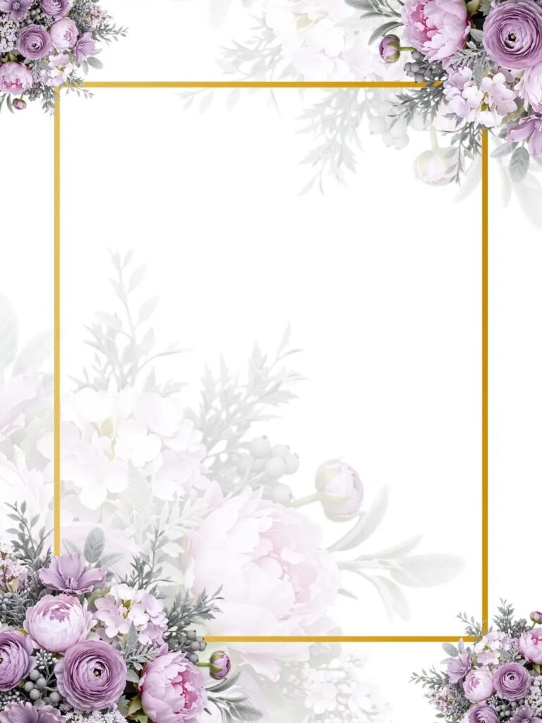
The 6 backgrounds run from a printed satin look you can stage for a photo to textured paper you can only appreciate in hand, and the cost climbs with every foil line and texture you add.
Your wording decides which one fits: long names and a full details block need a background that leaves the center clear, like a gold linear border or watercolor leaves kept to the edges.
A short invitation can handle a busier background, such as the beige watercolor floral. Foil adds to the print bill, so I would save the gold for the names and the date and print everything else in plain ink.
1. Gold Linear Border
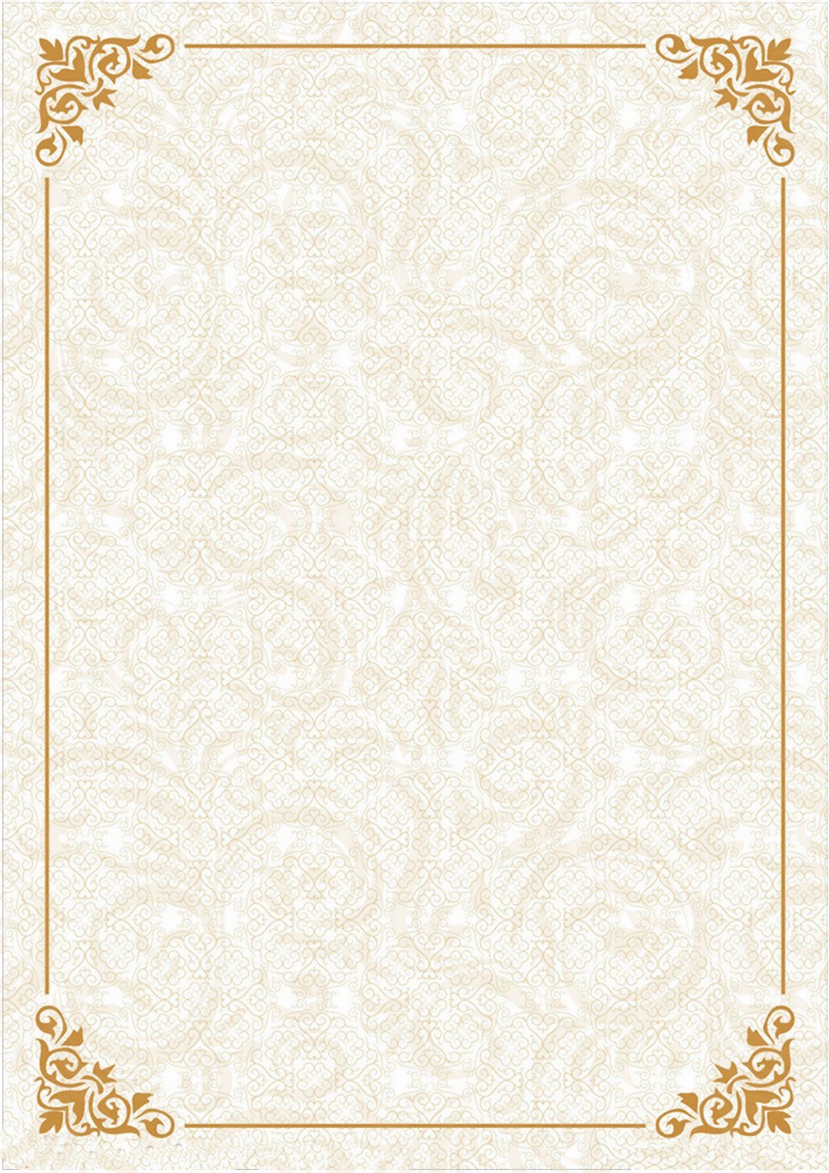
A thin gold line set just inside the edge does the work of a frame, and it suits a damask background because the pattern stays quiet while the border gives the card its shape.
Ornate corners are where I would spend the detail.
Keep the line fine and the background pale cream. A heavy border over a busy pattern fights the names, so I would leave generous empty space in the center for the text.
2. Gold Foil Accents
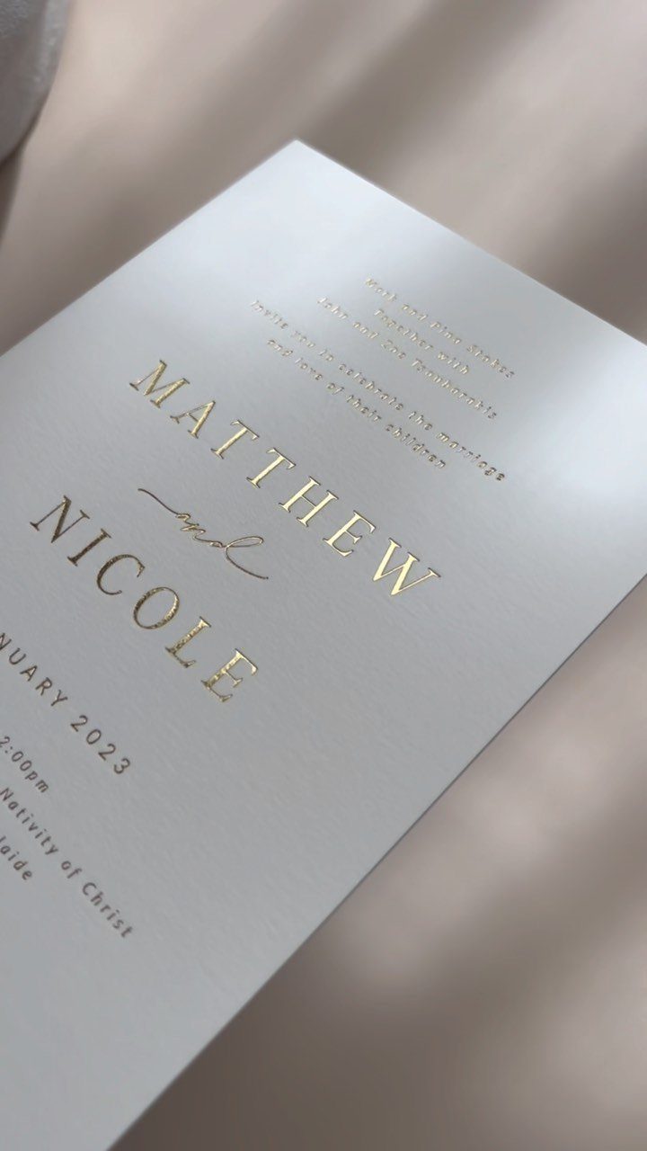
Gold foil on a white card is the simplest way I know to make an invitation feel expensive without adding a single extra element. Names and date are the right places for it.
Foil costs more than flat ink, so I would limit it to those lines and print everything else in a plain dark ink. Setting the card on satin or another soft neutral fabric for photos also shows off the shine.
3. Beige Watercolor Floral Design
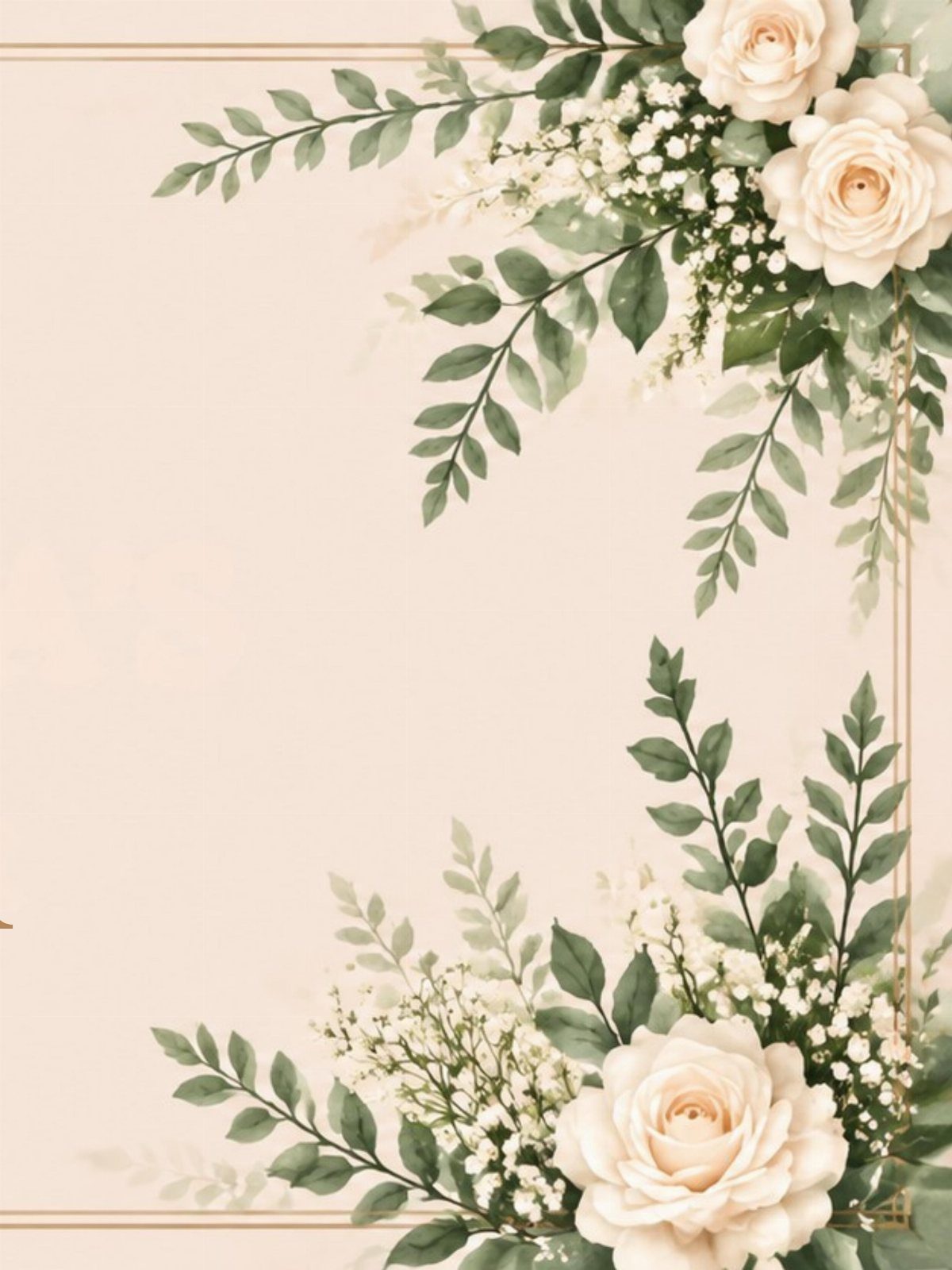
Watercolor roses placed in 2 opposite corners leave the center clear, which is what a beige background needs to keep the wording readable. White blooms and green leaves read soft against the warm tone.
A thin gold border pulls the loose painted edges together, and I like that pairing better than florals alone. Keep the flowers out of the text area, or the delicate look turns cluttered.
4. White Textured Paper Background
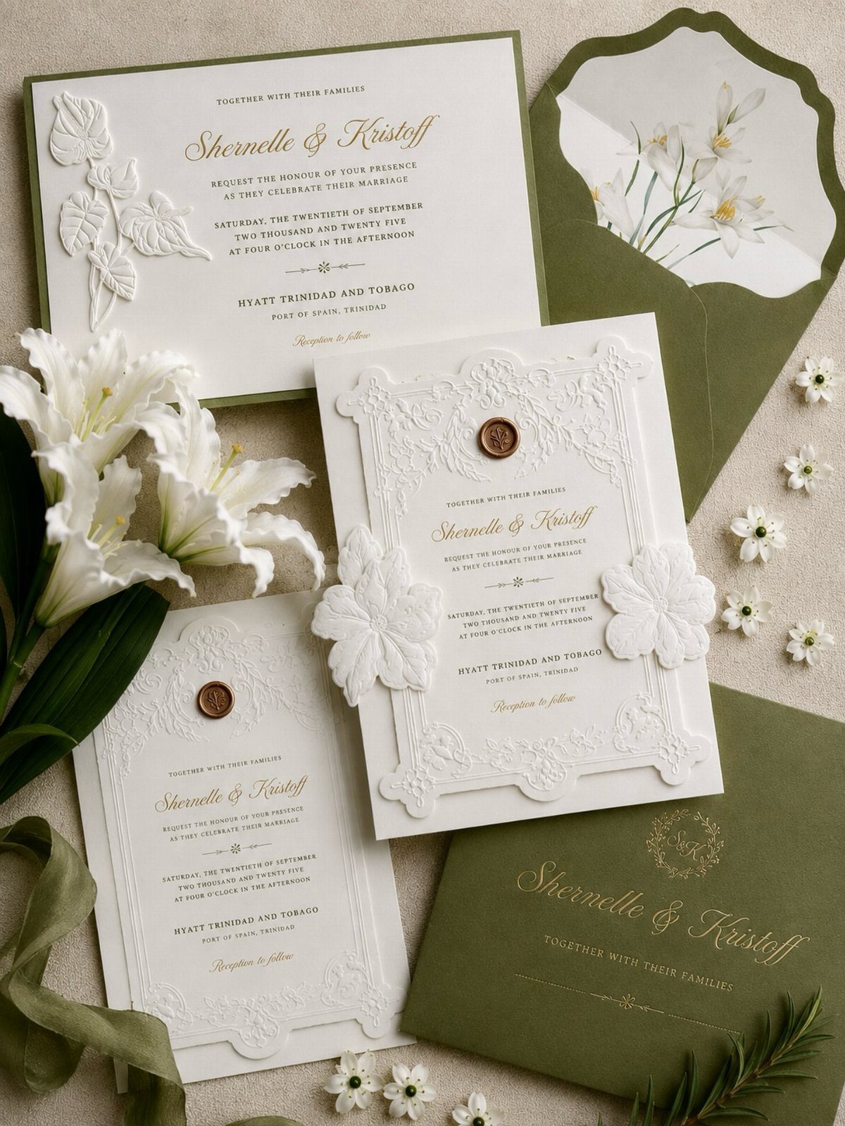
Embossed floral detail on white textured paper gives you pattern you can feel rather than see, so the card stays clean on screen and rich in hand. Gold lettering on top keeps it formal.
I would pair it with a colored envelope, since olive green makes the white pop the moment the suite is opened. Cheaper flat paper can fake the look in a scan, but not in the mailbox.
5. White Satin Fabric Background
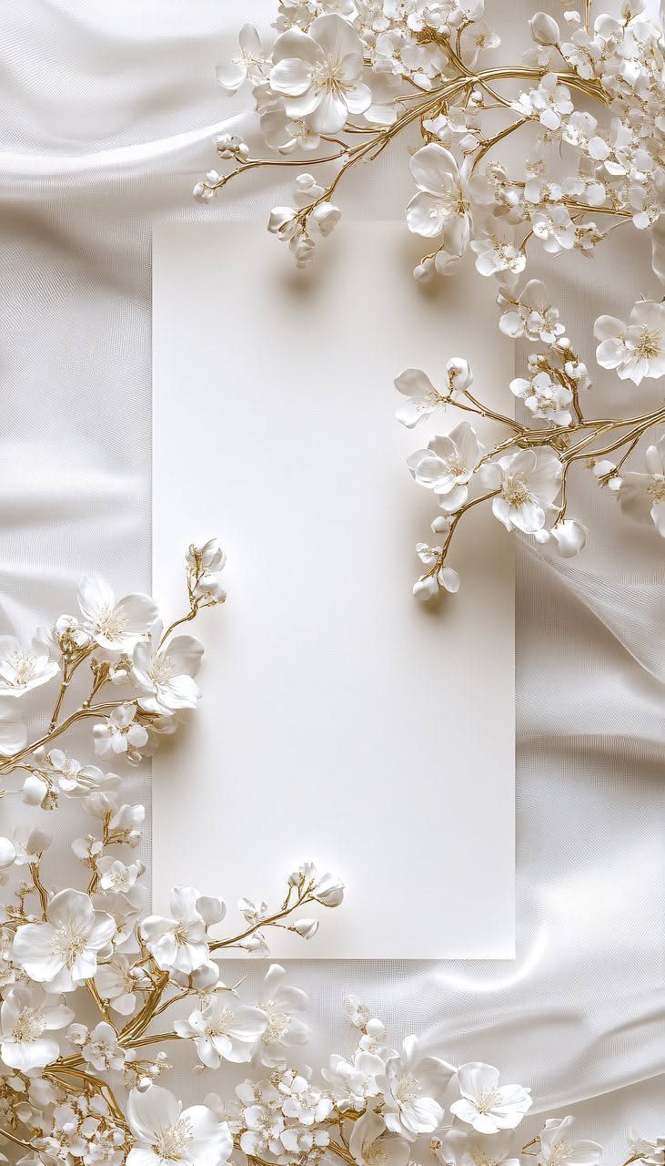
Draped white satin gives a card a soft, glowing backdrop, and it works whether you print the fabric look as a background or just use it to stage the photo. I prefer the second route for a modest budget.
Iron out creases first, because wrinkles in satin catch the light badly.
6. Watercolor Leaves on a White Background
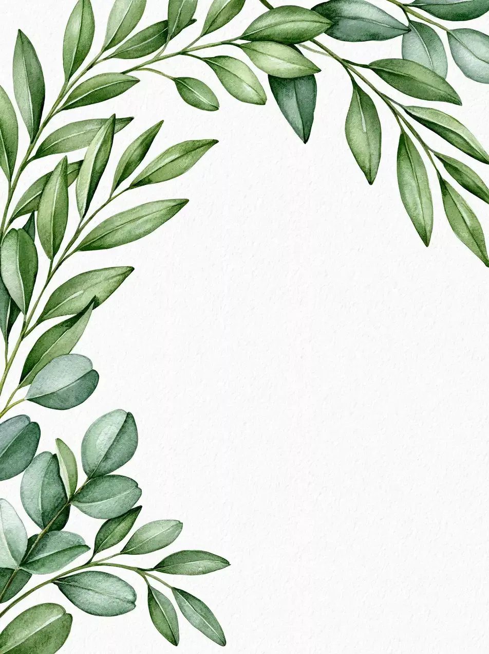
Green watercolor branches hugging the top and left edges of a white textured sheet leave a big open corner for your names. That asymmetry feels relaxed, and it is my pick for an outdoor or garden wedding.
Keep the leaves to 2 sides only. Wrapping leaves around every edge eats the writing space and loses the airy feel that makes this design work, so let the foliage gather in one corner or run down one side.