Printing is the main cost in any of these suites, and the list ranges from a navy floral card paired with blush pink to a translucent navy and blush invitation with the florals showing through.
If money is limited, pick the idea that lets you put the fancy treatment on a single piece, like the envelope lining or the top invitation, and leave the rest in plain stock.
1. Blush Pink and Navy Blue Floral Invitation
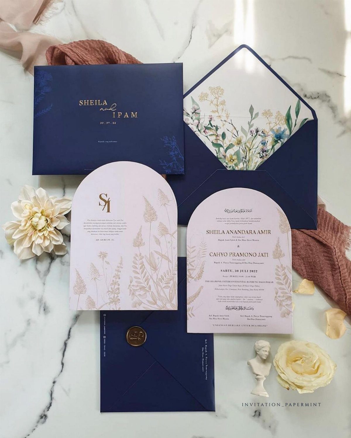
Navy against blush is a high-contrast pairing, and this set uses it well: the dark envelope frames a soft pink arched card, so the pink reads as the star.
I like that the floral lining stays hidden until the envelope opens.
Print work can go on the envelope lining while the cards stay simple, which costs far less when money runs short. A plain navy card next to a blush one costs less than printing florals on every piece.
2. Dusty Blue Blush Pink Elegant Garden Invitation
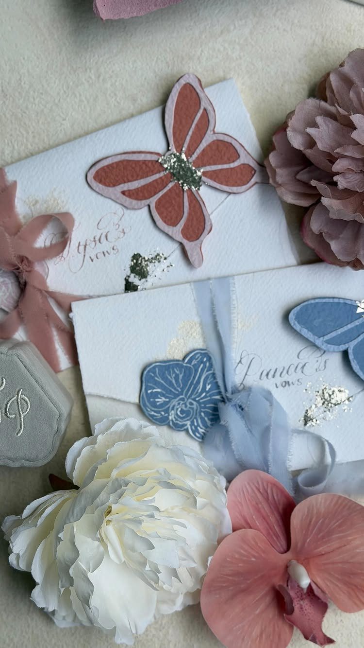
Cutout butterflies, one pink and one blue, let a white invitation carry both colors without looking busy. White keeps the palette quiet, so the 2 shades read as accents instead of competing.
I would choose this if you want a garden feel but dislike heavy florals.
Order a sample before committing, since cutouts depend on clean edges and thin paper can look flimsy against fresh peonies or any bouquet you pair it with.
3. Navy and Blush Floral Translucent Invitation
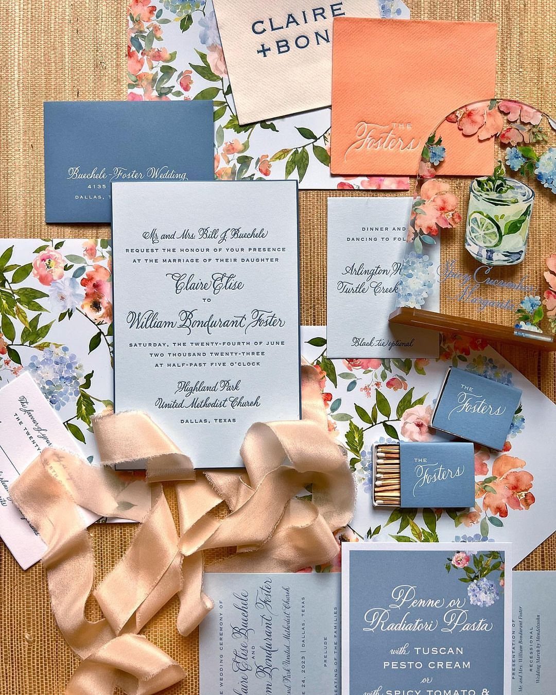
Translucent stock changes how an invitation feels in the hand, and layering it over navy cards gives the blush florals real depth. A satin ribbon ties the stack together without adding another printed piece.
Expect to pay more than for flat cardstock, so I would use acrylic or vellum for the top invitation only.
Keep the details cards plain navy. Check that the names stay legible where the florals sit behind the type.
4. Blue and Pink Wedding Invitation Set
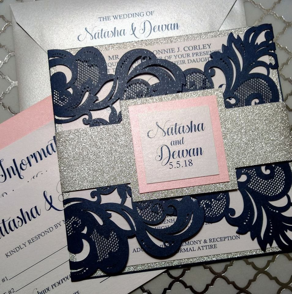
Laser-cut work is the splurge in a suite like this: a blue sleeve with a floral cutout lets the pink center card glow through, and a silver glitter band holds the pieces together.
The date sits on the pink card, so it stays easy to find.
Laser cutting usually costs more per suite than printing alone. If you need to trim, cut the sleeve for the main invitation and send the information card and envelope in plain stock.
5. Pastel Wildflower Wedding Invitation
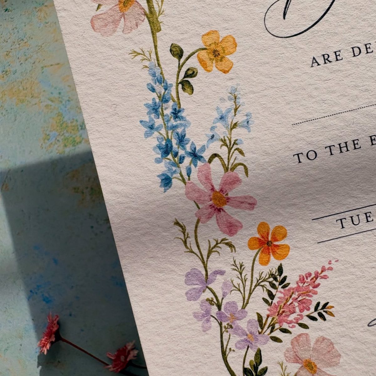
Watercolor wildflowers in blue, pink, and yellow on textured paper give this one a handmade look, and the yellow keeps the pastel pair from feeling too sweet. Textured stock suits the painted look better than glossy paper.
If you paint it yourself, scan one finished piece and print copies, which is far cheaper than painting every card by hand. Keep the text area clear so the florals frame the words instead of crowding them.