Mid century modern invitations run from a bold color card with small geometric shapes to a full boxed set with matching stationery, and the cost and postage climb with each step toward the box.
Your palette picks the style: a bold one calls for a boxed invitation so the colors have room to sit apart, while an arched card gets its retro look from shape alone.
Ask for a printed proof before you commit to a full run, because saturated colors often look different on paper than they do on a screen.
1. Bold Color Mid Century Modern Wedding Invitations
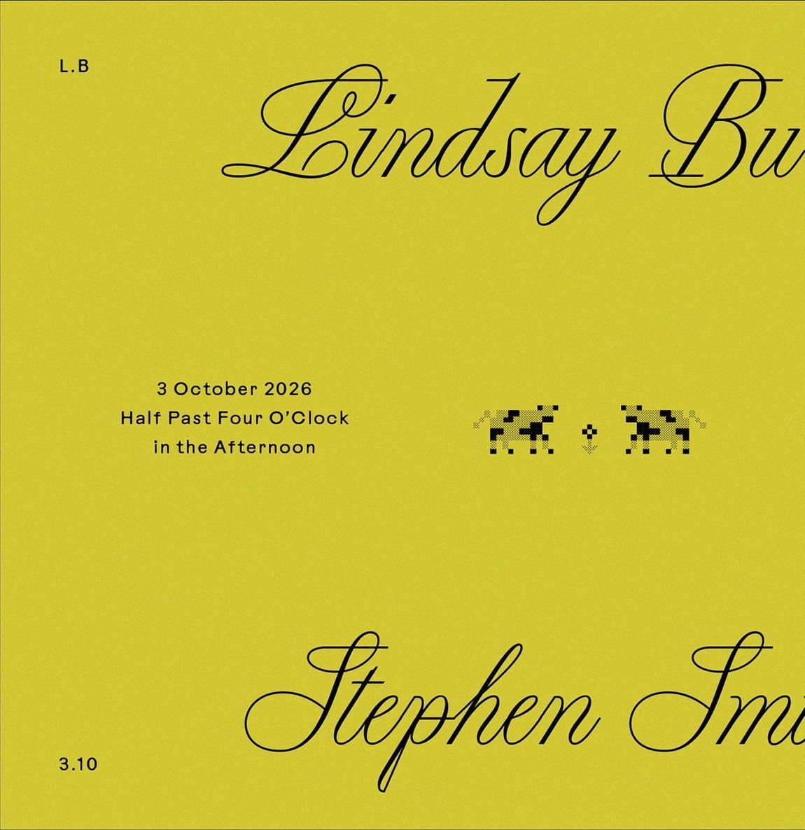
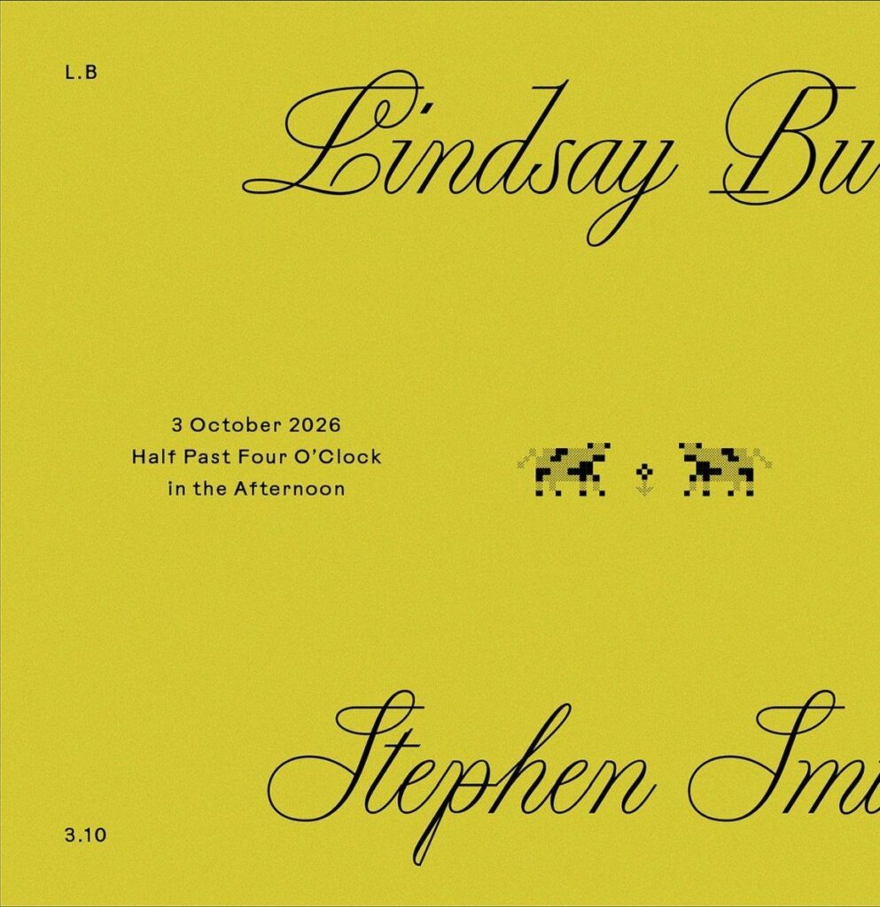
Yellow does the heavy lifting on a mid century invitation, and black cursive names keep it from feeling loud.
Strong contrast between ink and paper is what makes a saturated card readable, so I would pick one bold background and hold everything else to a single dark ink.
Small geometric graphics, like the animals on this card, carry the mid century feel without crowding the wording. Keep them small and leave open space around the date and time.
Order a printed proof before the full run, since bright colors can shift from screen to paper.
2. Matching Mid Century Modern Wedding Stationery Suite
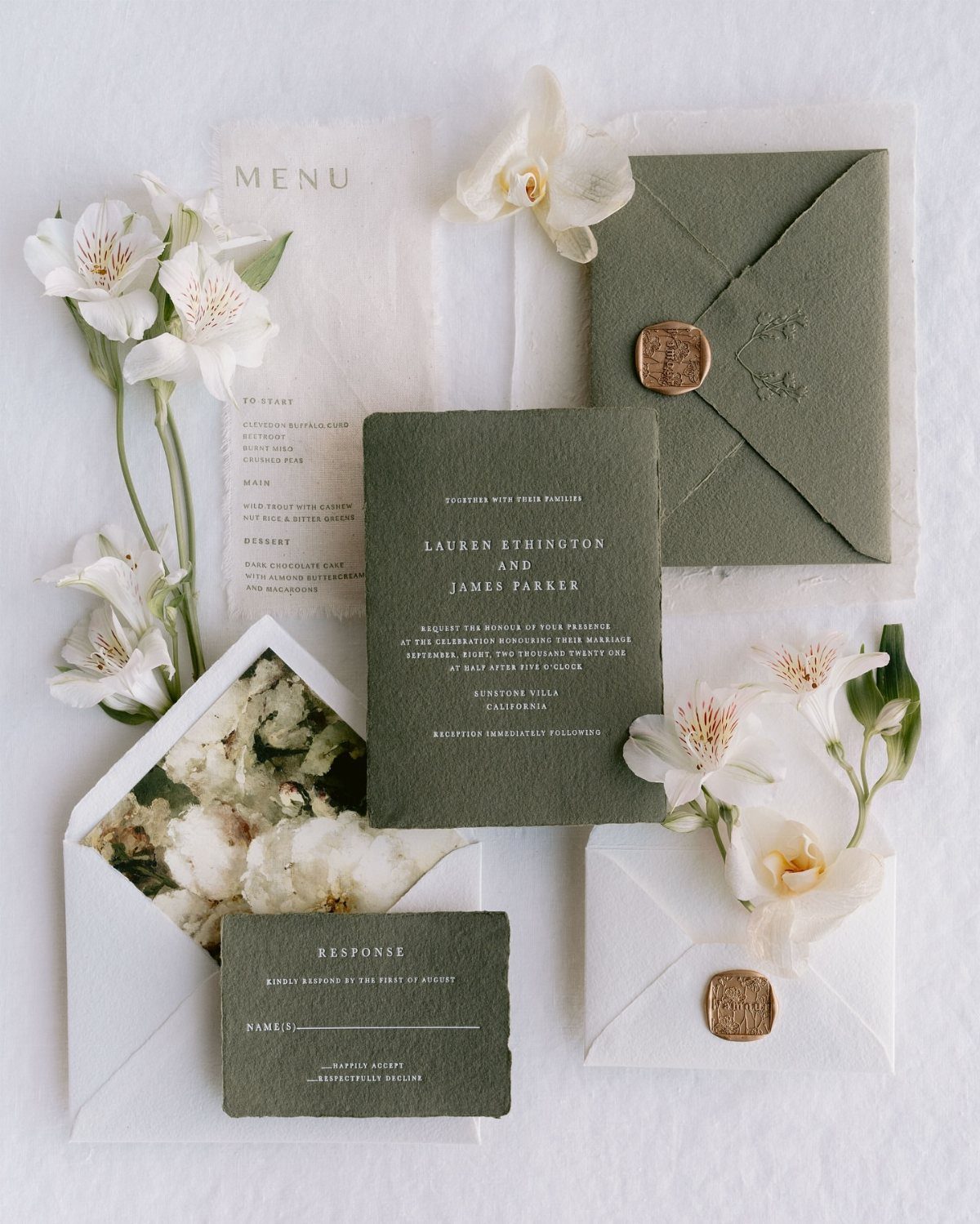
A suite works when one color and one type style repeat on every piece.
I would settle the palette first, then order everything from one designer or print run so the greens match. Add pieces only if you will actually use them; a menu earns its place, a fifth insert rarely does.
3. Boxed Mid Century Modern Invitation
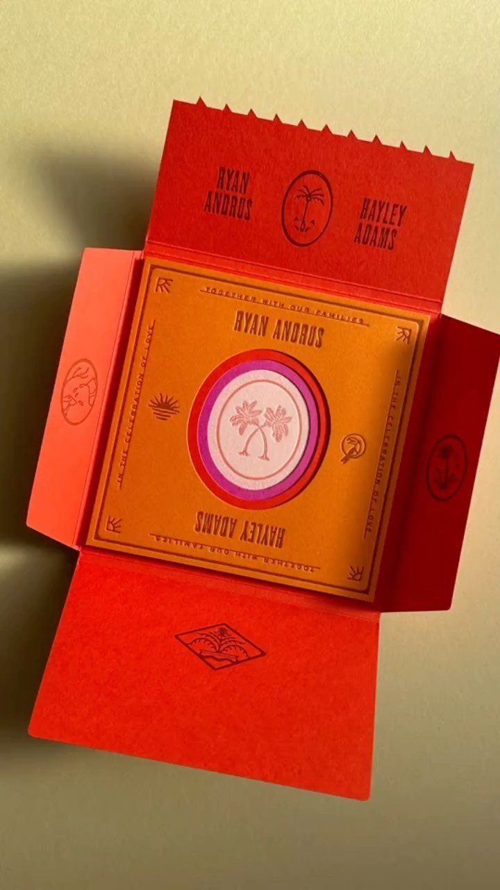
Opening a box makes the invitation feel like a small gift, which is why I like this format for a couple with a bold palette.
A red box around an orange card with a pink circular palm tree motif is a daring mix, and the box frame keeps the colors from fighting.
Expect a higher cost than a flat card, plus extra postage for the weight. If money is limited, box only a small group, like parents and the wedding party, and mail flat cards to everyone else.
The minimum number of invitations you can order is 10, which is perfect for that elegant micro wedding or elopement. The cost per card will decrease when you order a higher quantity.
— Minted
4. Arched Wedding Invitations
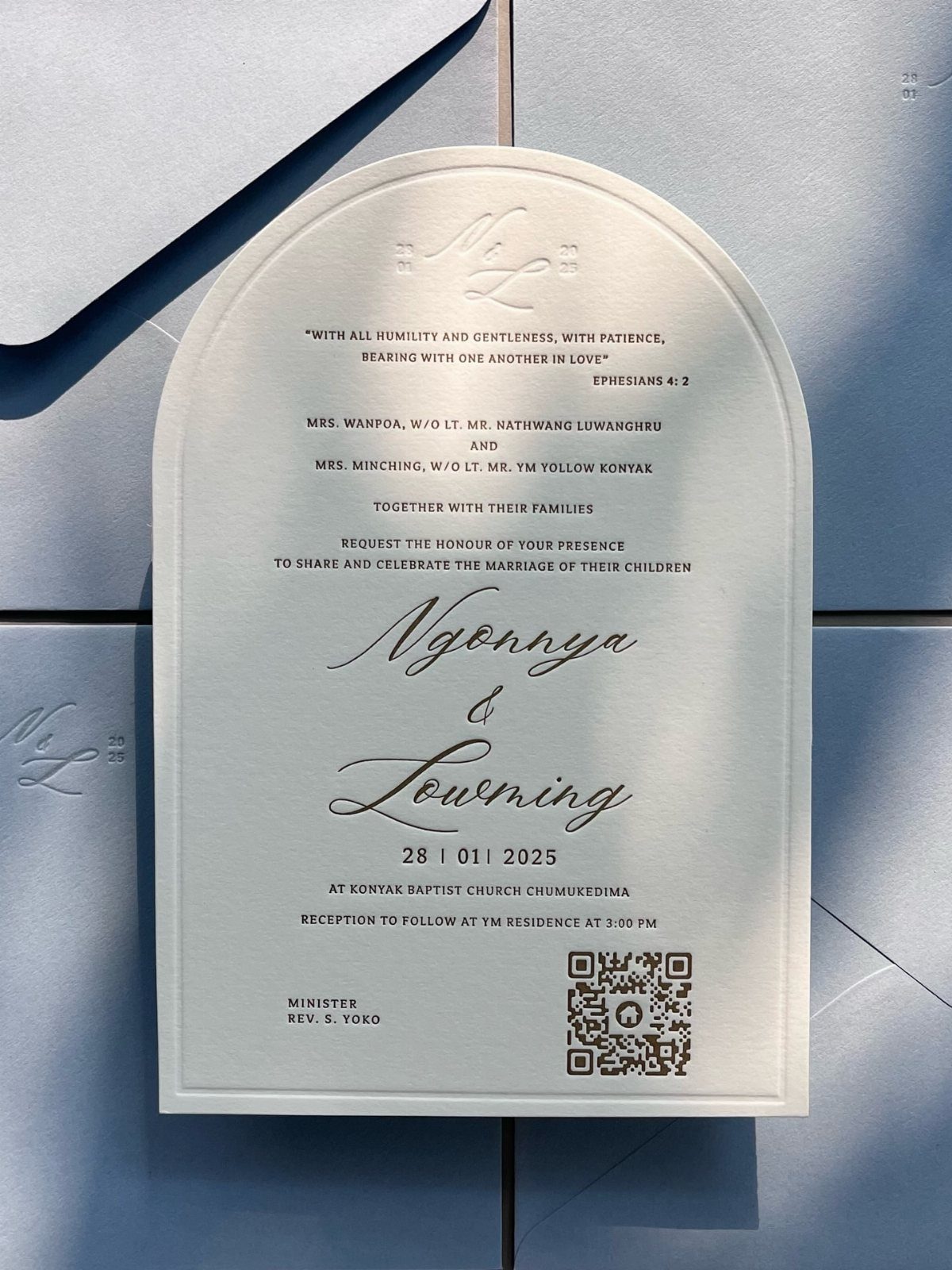
The curved top is the whole idea: one arched edge gives a plain white card a retro silhouette without extra ornament. Clean black type fits it best, and I would keep the text centered so the lines follow the curve.
Leave a generous margin near the arch, because words pushed too close to the curve look cramped. A QR code, as on this card, can hold the RSVP or details so the card stays uncluttered.
Ask your printer whether an arched cut costs extra.
Design Customization Tips
Online card designers let you change fonts, colors, and layouts yourself, and the better ones show an instant preview, so you see what will print before you pay. That beats waiting on a designer for every revision.
Check how many colors you can pick from.
One tool offers over 160, which lets you match your wedding palette instead of settling for 3 or 4 preset themes. Some tools also let you add photos.
Use a built-in spell check if the tool has one, but do not rely on it alone.
Names and venue addresses are where errors hide, so have a couple of fresh readers go over the final proof out loud before anything goes to print.
If you want a vintage look drawn from scratch, some print companies offer custom design services.
Expect a few steps: you submit your details first, then they build the design around your vision. That costs more than a template, so decide early whether the extra money is worth it.
Frequently Asked Questions
What gives wedding invitations a mid-century modern look?
Small geometric graphics, a bold color against strong contrast, and plenty of open space do most of the work.
A yellow card with black script lettering, or a white rectangle with rounded corners, signals the era without needing a label. Pick one saturated color and one dark ink so the wording stays easy to read.
How do I match mid-century modern stationery across the whole suite?
Pick one accent color and one typeface, then use both on every card in the suite.
Lock down the palette first, then buy all the pieces from a single designer so the ink matches. Skip any insert you will not actually hand to guests: a printed menu matters, but most couples never need 5 enclosures.
Are boxed wedding invitations worth the extra cost?
They cost more than flat cards and weigh more, so postage goes up too. When the budget is tight, put the boxed version in front of your parents and attendants, then send flat cards to the rest of the list.
The box frame also keeps bold colors, such as red around orange, from fighting each other.
How can I avoid color surprises when printing bright invitations?
Get a physical sample before the printer runs 150 cards. Bright ink looks different on paper than it does on a screen, and a proof lets you see the real color while there is still time to adjust it.
How do I catch mistakes before invitations go to print?
Run spell check if the editor has it, but read the card yourself afterward. Typos hide in proper nouns, so hand the final draft to 2 people who have not seen it yet and ask them to read it aloud.
Can I customize a mid-century modern invitation online?
Yes. Most online card sites let you swap fonts, adjust colors, and rearrange text blocks yourself, then show a live preview as you work.
One company stocks more than 160 ink colors, so you can dial in your exact palette rather than choose from a handful of pre-set options.
For an invitation designed from the ground up, some printers offer full custom work, which runs several times the cost of editing a template.