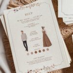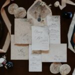
Non-traditional invitations run from illustrated cards to wooden sheets, rolled scrolls or pop-up designs, and the price climbs with every custom shape, wax seal and layer added.
What decides your pick is how many invitations you have to assemble and mail, since a custom shape, a wax seal stamped one at a time or an extra layer multiplies across the whole guest list.
Weigh one finished invitation before buying stamps, because wood, burlap, scrolls and layered designs all add ounces that a standard card never does.
1. Bold & Illustrative Wedding Invitations
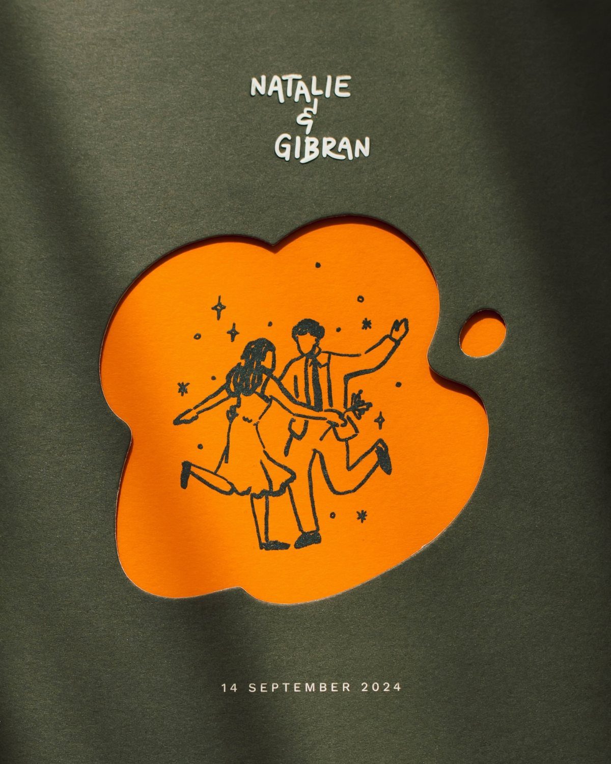
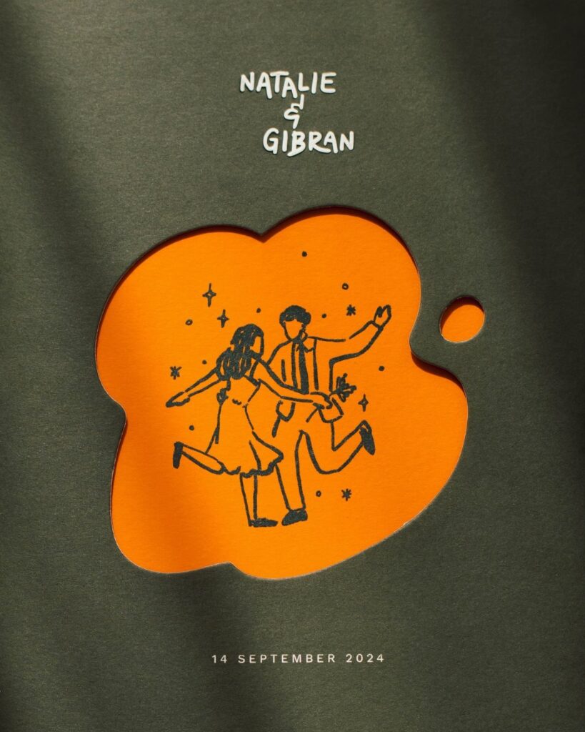
2 colors that clash a little on purpose read as confident, not messy.
Pick a palette with real contrast, then keep the type plain so the illustration carries the personality. A couple-as-characters drawing also works as a signature you can repeat on programs and signage.
Die-cut layers cost more than flat cards, so ask a printer for a quote first.
2. Arch-Shaped Wedding Invitations
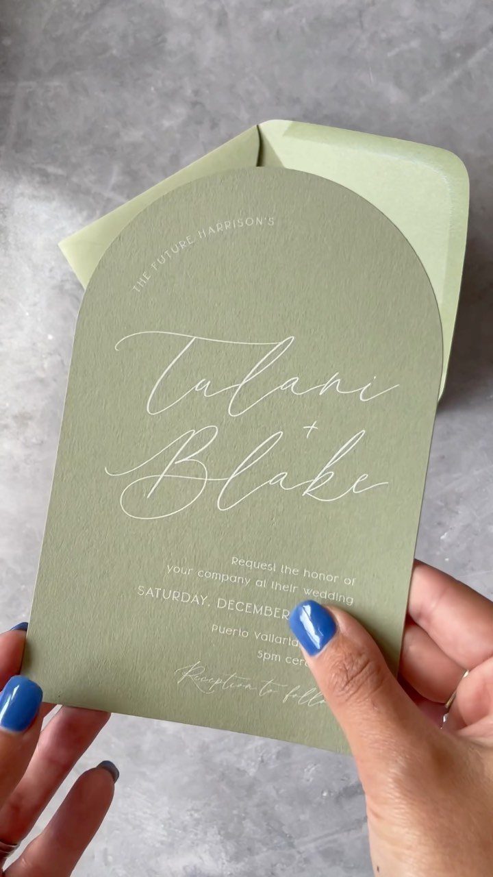
Cut the top into an arch and the invitation stops looking like every other card in the mailbox.
Keep the color tone-on-tone with the envelope, as this one does, so the shape becomes the detail that catches attention. White lettering on a soft green stays readable without needing a busy design.
A custom shape usually means a custom die, so expect a higher price than a standard rectangle.
3. Destination-Focused Wedding Invitations
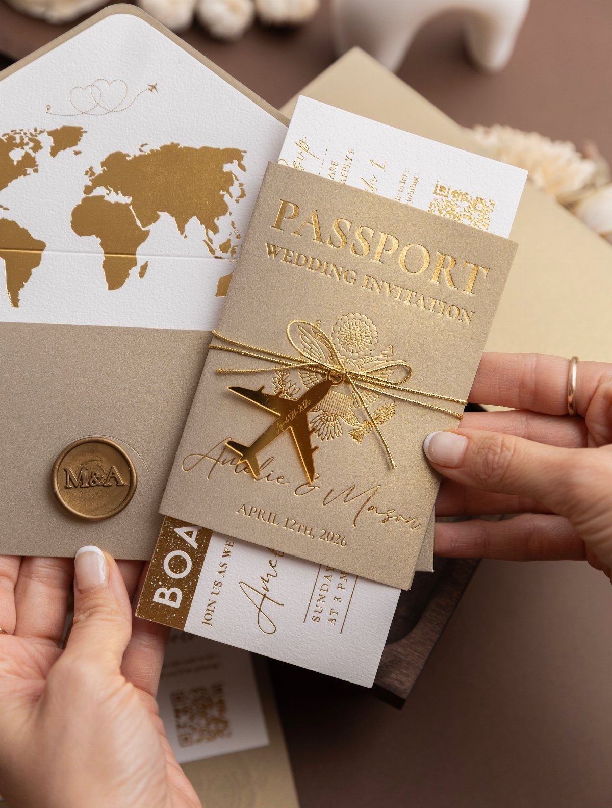
Guests who open a passport-style invitation know where they are headed before they read a single word.
I like the boarding pass most, because it gives you a clean place to put the details: date, venue, and the RSVP deadline.
If your wedding is local, borrow only one piece, like the map liner, instead of the full travel theme. Several small pieces add up in printing and postage, so price the whole suite first.
4. Watercolor Wedding Invitations
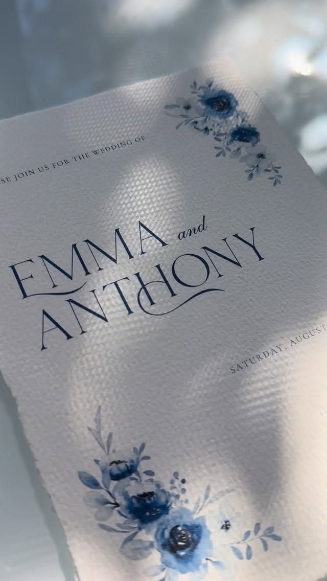
Texture matters here, since it makes the paint feel like it was applied by hand.
Painted art is usually scanned and then printed, so one original can cover your invitations, envelopes, and day-of paper.
The artist behind this piece said it did very well with their printer, which is a good reason to ask any printer about test prints on textured stock when you place an order.
5. Vintage-Inspired Wedding Invitations
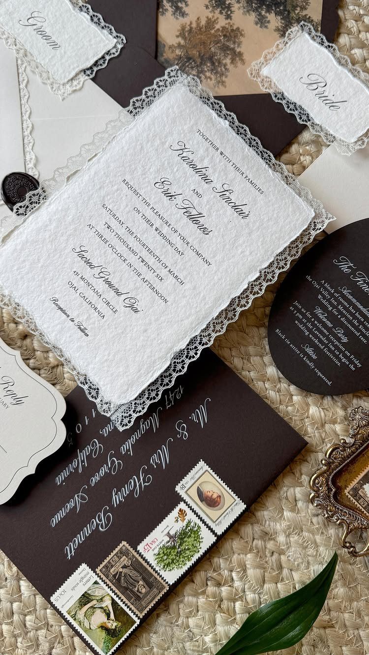
Lace borders, wax seals, and antique postage stamps pile up on one flat lay, and the dark brown envelopes make the lighter paper glow against them. Handmade cotton paper gives this suite that soft, aged feel.
Layering is where the charm lives, but every layer adds assembly time and weight at the post office. Have one fully assembled invitation weighed before you buy stamps, so you do not guess at postage for the whole batch.
6. Moody Floral Wedding Invitations
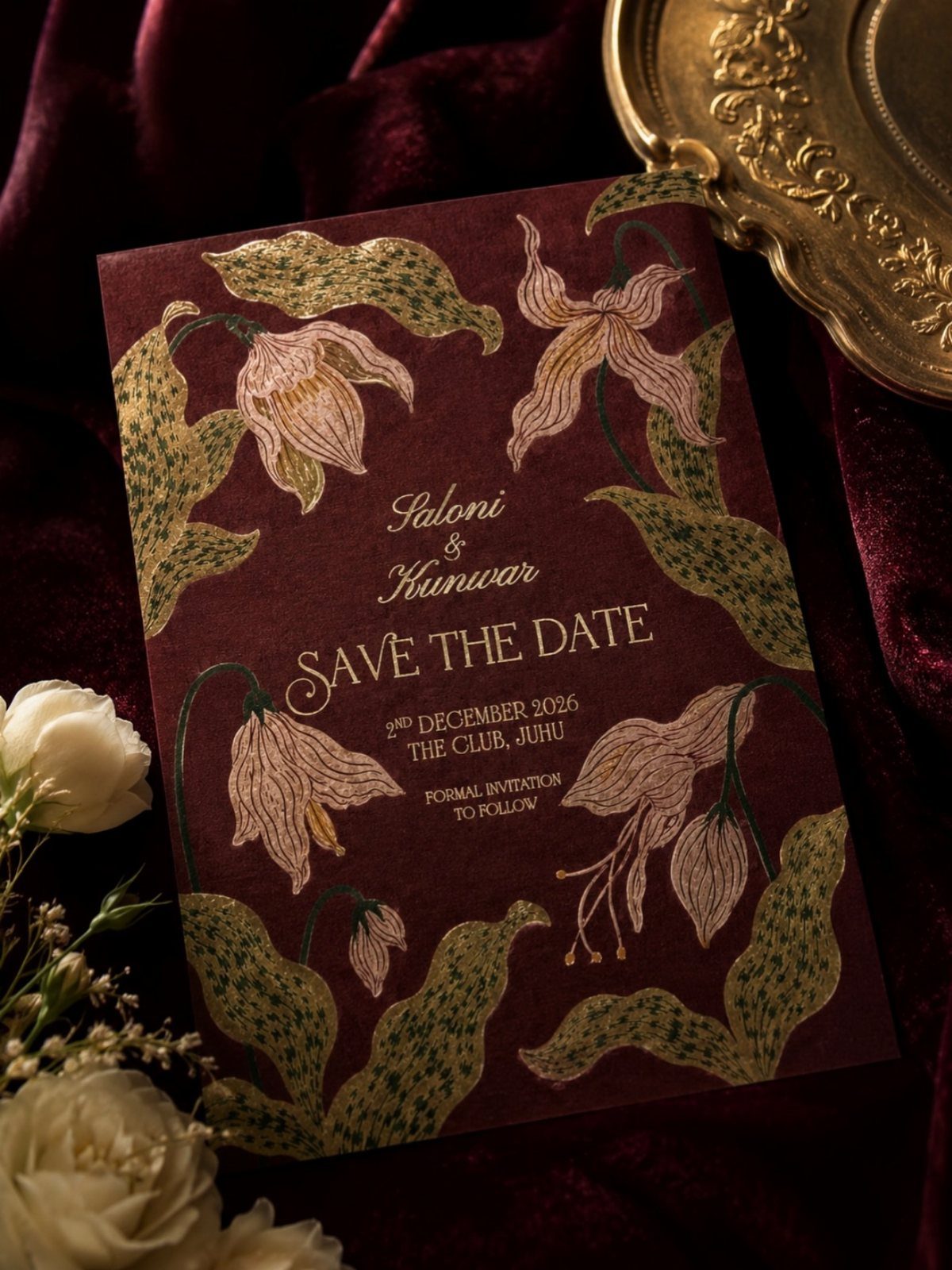
Burgundy with gold florals feels like evening, and that is the whole appeal.
Choose gold or another metallic for the flowers so they do not disappear into the background. Light-colored ink on dark stock needs a printer who handles it well, so ask to see a sample when you place an order.
I would match the invitation suite to the save the date, so the darker mood carries from the first mailing to the last.
7. Type-Focused Wedding Invitations
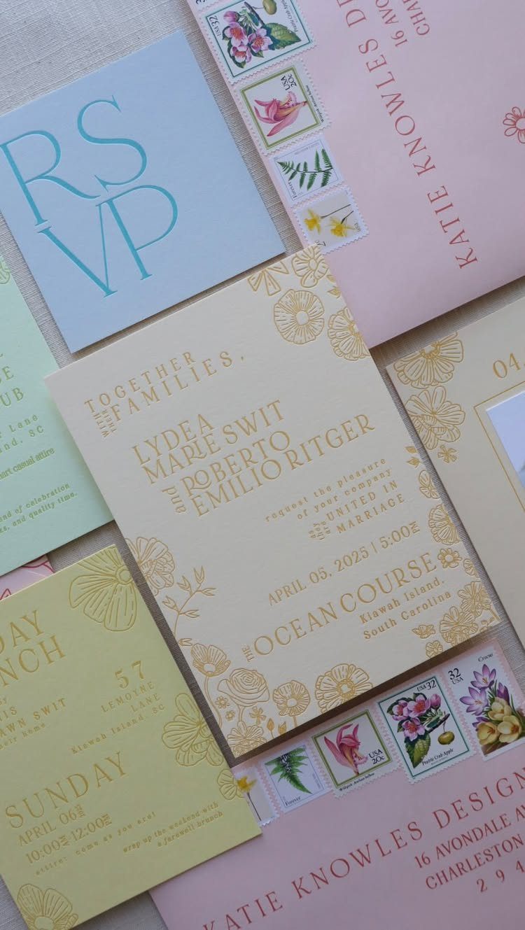
Big, confident lettering does the decorating here, so the card needs no illustration at all. Pastel stock in yellow, blue, and pink keeps the type from feeling stern.
Pick one typeface for names and let a quieter one handle the details. Set the venue line in capitals, as this suite does with the course name, so guests find the location fast.
Order a printed proof first, since small type on colored paper can blur.
8. Ornate Calligraphy Wedding Invitations
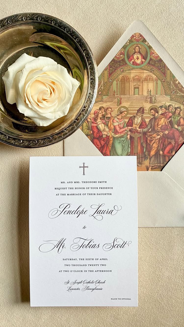
Calligraphy this ornate is the whole design, so leave the rest of the card plain white and let the loops and flourishes work.
Names get the most elaborate script. Set the date and address in a simpler hand, because a guest has to read those without squinting.
Hand-lettered work eats a calligrapher’s hours, so get a quote first, since the price can change your mind about it.
A cheaper route is to hire a calligrapher for the names alone and print that script from a digital file on every invitation.
9. Photography Stationery
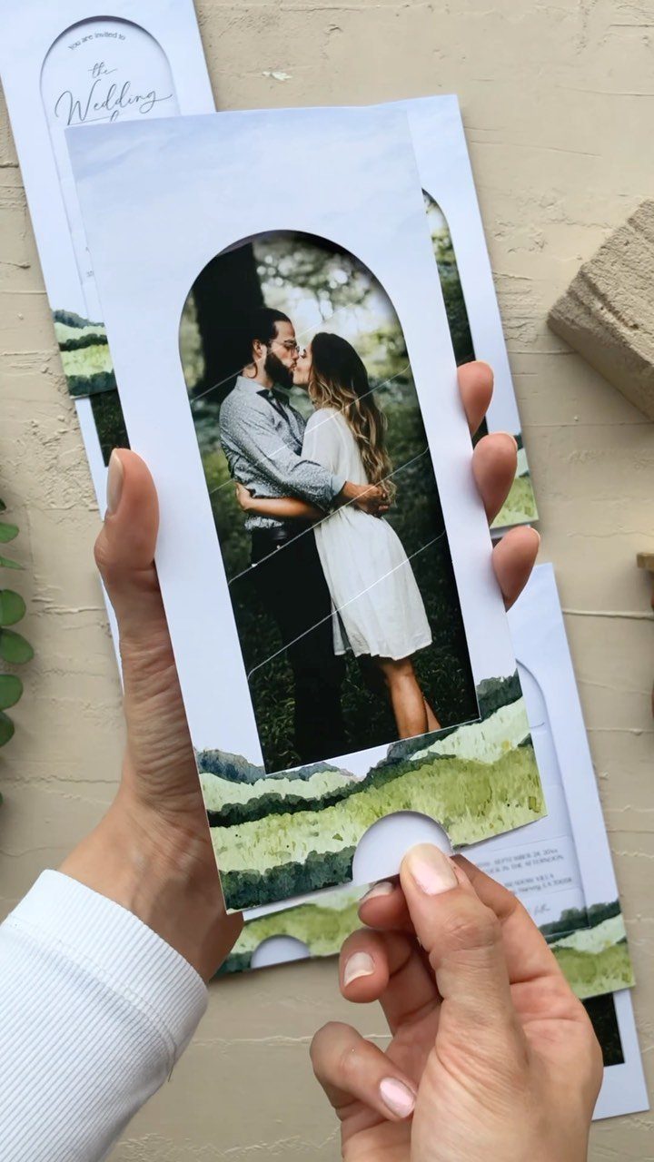
A photo of the two of you tells guests who is getting married before they read a name. An arched frame, like this one, gives a plain portrait a softer, more designed edge.
Choose a picture with room around your faces, so the frame does not crop anyone. Pair it with a simple graphic along the bottom edge and keep the text short.
I would pick a shot where you look relaxed over a posed one. Print quality matters more here than on any type-only card, so request a photo test print.
10. Monogram Wedding Invitations
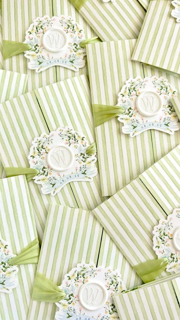
A single letter repeated on every seal turns a stack of striped cards into a set. Here the "W" sits in a floral wax seal, and the date, 08.08.26, doubles as a design element.
Keep the monogram simple enough to read at seal size. Use the same mark on the envelope, the program, and the signage.
Wax seals add assembly time per invitation, so count your guest list before committing to them. A printed monogram on the envelope flap is the budget version.
11. Circular Invitations
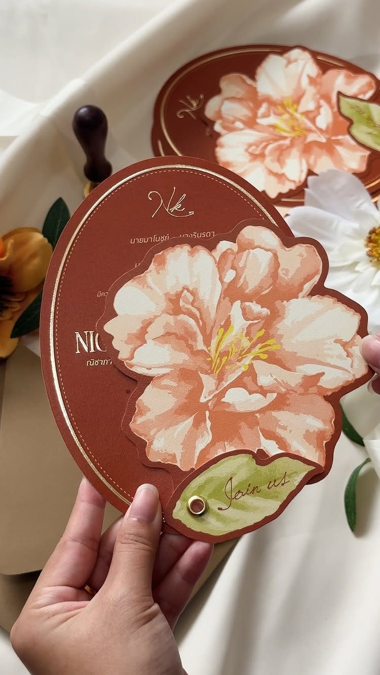
A round card breaks the rectangle habit without any extra ornament. The large flower on this reddish-brown one fills the circle edge to edge, so the shape and the art work together.
Round invitations need a die-cut, which adds cost, and they usually need a custom envelope or a square one. Ask your printer about both before you design.
Gold lettering on a deep color reads clearly, and I would keep the center of the circle open for the main text.
12. Wooden Invitations
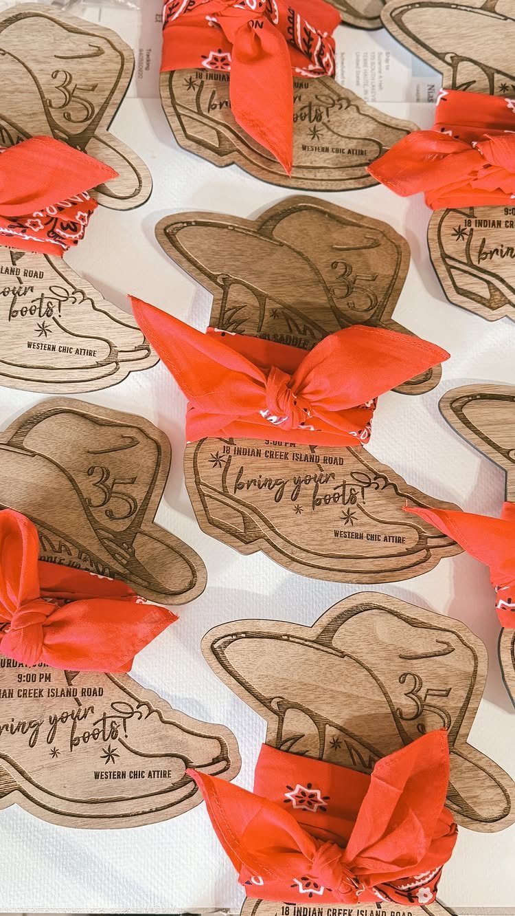
Cut a thin wood sheet into the shape of your theme, and the invitation becomes a keepsake.
Boots, hats and red bandana ties fit a western wedding, and mailing the invitations with the bandanas tucked in gives guests their first costume cue.
The maker said every piece was made with rustic textures in mind, which is the quality to look for in wood: grain you can see and feel.
Put the dress code and address right on the wood, as this set does, so nothing gets lost. Wood is heavier than paper, so weigh one before buying stamps.
13. Lace-Trimmed Illustrated Envelope Suites
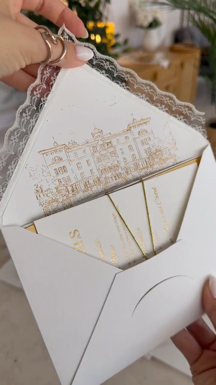
A lace trim turns the envelope into part of the invitation, so guests feel something delicate before they open the card. Gold foil on a building illustration gives that softness a crisp counterpoint.
The maker described the lace as the most romantic finishing touch, and I agree it is the right place to spend. Keep the card inside simple and gold-edged, so the envelope stays the star.
Lace and foil add cost, so price a sample before you order the full count.
14. All-Black Wax Sealed Envelopes
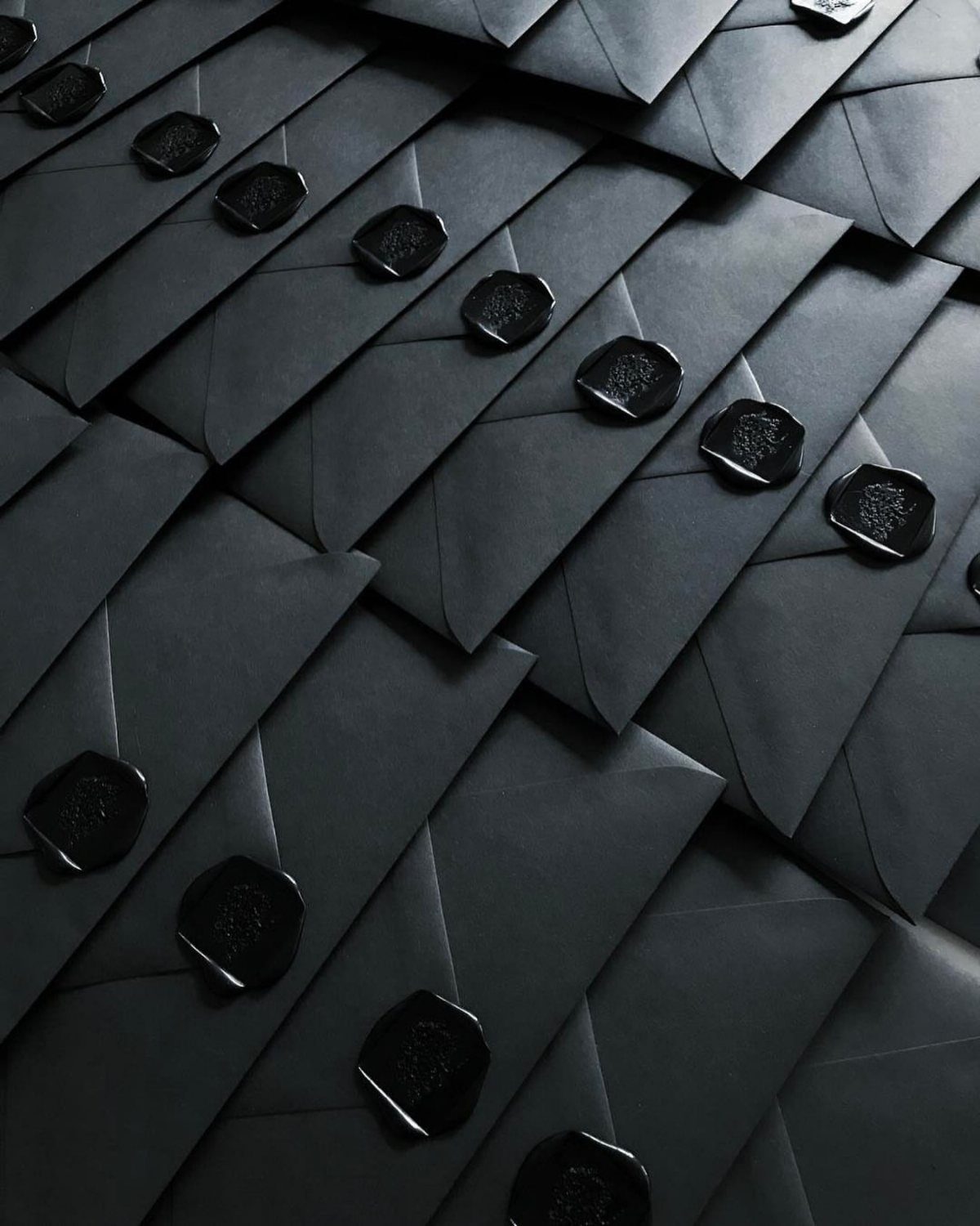
Matte black envelopes with black wax seals make the mailing itself the statement. Nothing else is needed on the outside.
Black on black has little contrast, so the seal’s texture does the work.
Each seal is stamped one at a time, so count your guest list before you commit. I would put the details on light inserts inside, since dark paper makes small type hard to read.
15. Scroll Wedding Invitations
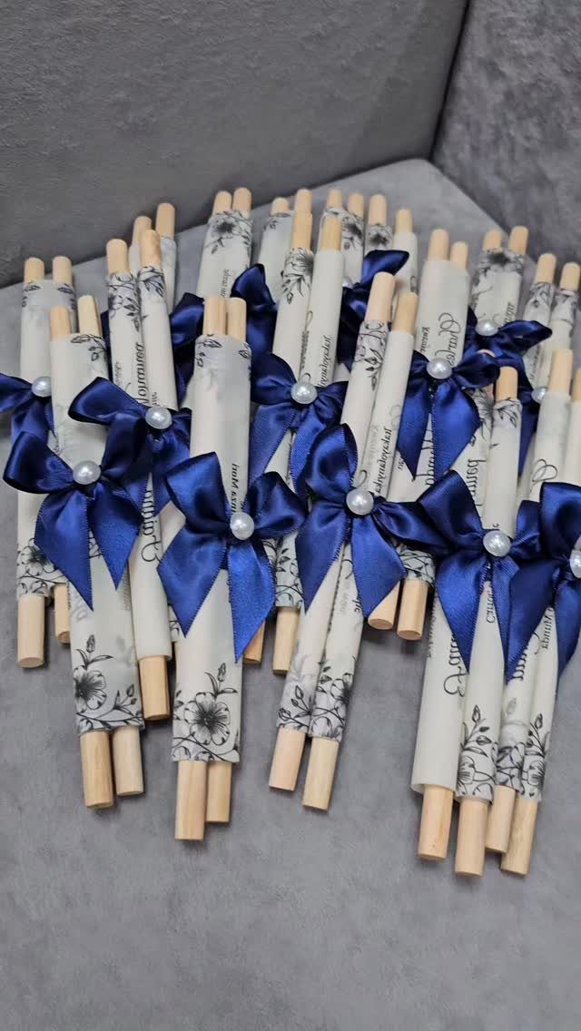
Rolling the invitation around a wooden dowel makes opening it a small ceremony. A satin bow and a few pearls hold it closed.
A cream floral print keeps the scroll soft, and I like blue ribbon against it. Choose a paper that rolls without cracking, and test one roll before ordering.
Scrolls are fiddly to assemble and don’t lie flat in a standard envelope. Ask a printer about tubes or boxes for mailing, and weigh one finished scroll before buying stamps.
16. 3D Pop-Up Invitations
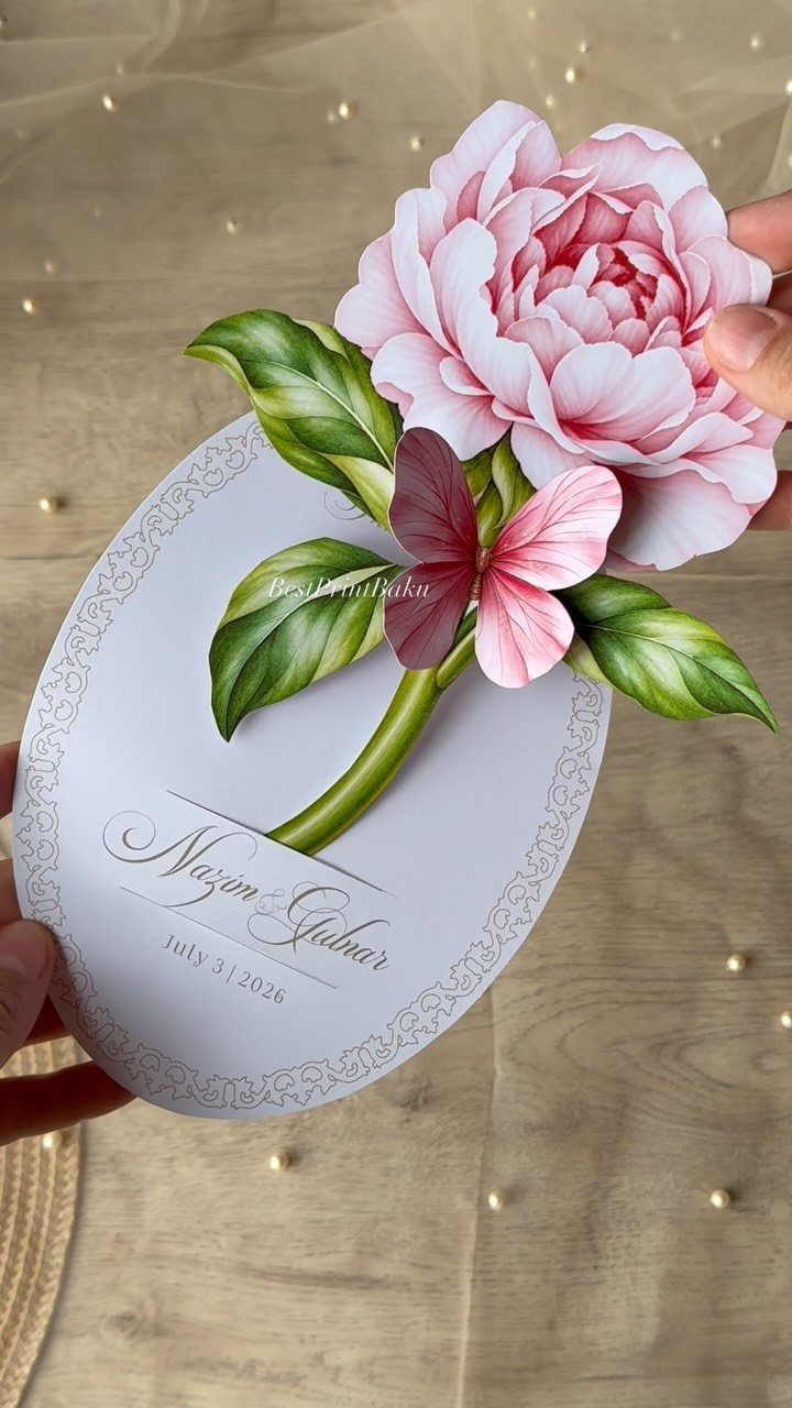
A paper peony that rises from the center of an oval card gives guests something to touch, not just read. The names and date sit around it, so the flower stays the focus.
Pop-ups are layered and assembled by hand, which makes them one of the pricier options here. They also need to fold flat for mailing, so ask the maker how the flower is packed.
I would save this for a short guest list.
17. Scalloped-Edge Invitations

Scalloped edges soften a rectangle without changing its size. Red roses on cream feel romantic, and a heart-shaped maroon wax seal under a white ribbon ties the palette together.
The scallop is a cut, so expect a die charge on top of printing. Pick one accent to repeat, such as the maroon of the seal, rather than adding more colors.
Wax and ribbon both add assembly time, so skip one if the budget is tight. I would keep the ribbon.
18. Burlap Layered Invitations
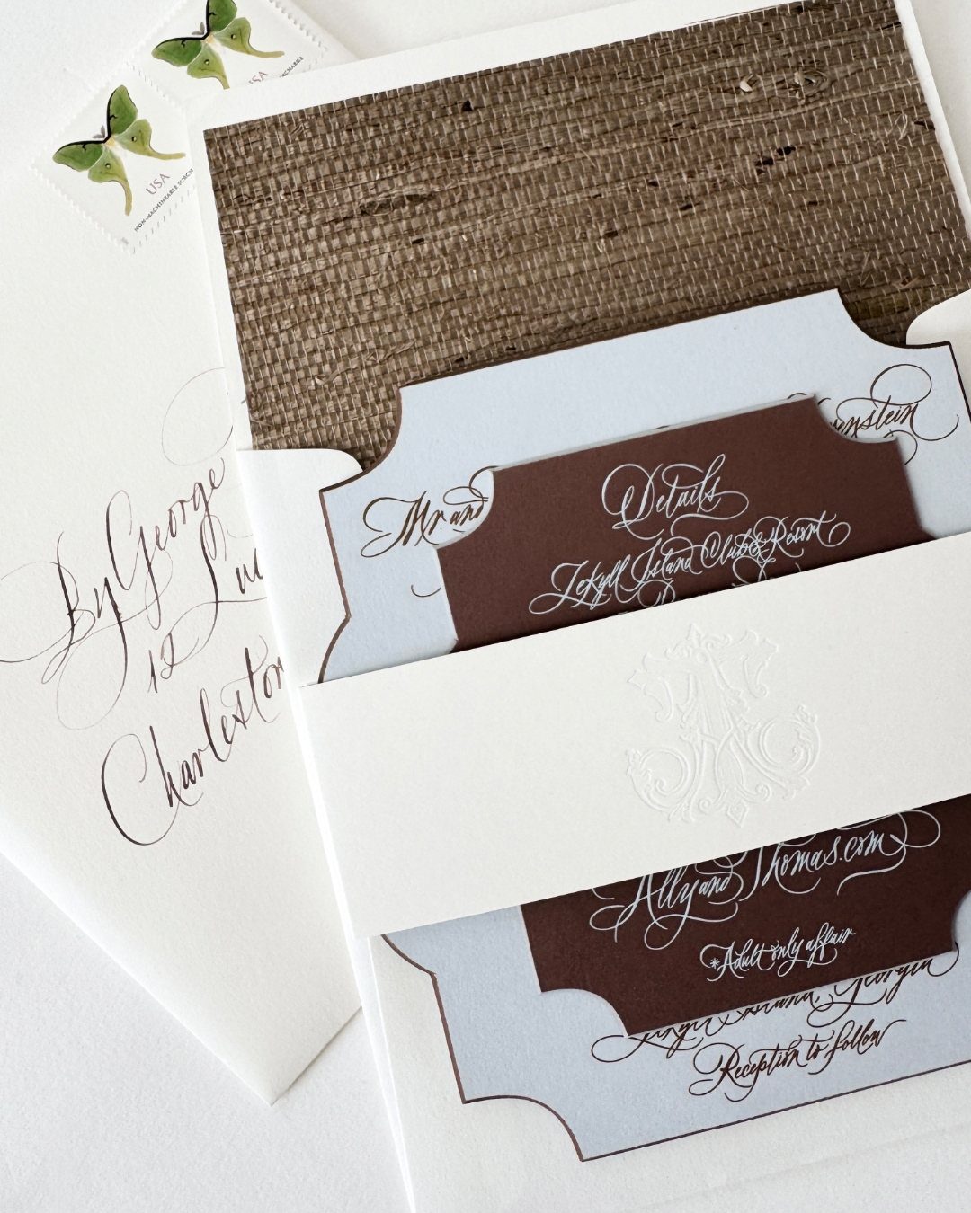
Burlap behind soft blue cardstock gives a rustic suite a gentler face. The rough weave and smooth paper contrast nicely, and white calligraphy on brown inserts reads clearly.
Burlap sheds fibers and adds bulk, so ask for a sample before ordering. Thin burlap or a printed burlap texture is the cheaper route and mails more easily.
Weigh one assembled suite before buying stamps, since every layer adds ounces.
Choosing the Right Style
Book the venue first, then pick the invitation. The paper is the first preview guests get of the day, so it should match the room and the mood you’ve already committed to.
Say your style out loud in two or three words, like "joyful and casual" or "sleek and formal." If a design doesn’t fit those words, skip it, no matter how pretty it looks on its own.
Darker or less expected colors can work at an elegant wedding. Ivory and blush are the usual choices, so a bolder palette is an easy way to stand out without changing the format.
Customization Options
If a stock design is close but not right, a designer can adjust it. A patterned envelope liner, a vellum overlay, or a wax seal are the details I would ask about first.
Ask for a quote on each add-on separately. That lets you drop the priciest one and keep the rest.
Tie the details to your venue and your personality, not to a trend. A farm, a ballroom, and a gallery each call for a different look, and the same suite rarely suits all three.
Personalization
A monogram is the easiest way to make a suite yours without overdoing it. Design one from your initials, and it can appear on the invitation, a belly band, and the reception menu.
It also lasts past the wedding, since you can keep using it on stationery as a married couple.
A photograph is the other personal option. Choose one that feels like the two of you, and keep the rest of the design quiet so nothing competes with it.
Pick one personal element and repeat it. Two or three of them on one card start to feel crowded.
Frequently Asked Questions
What are some unique wedding invitation ideas?
Arch-shaped or round die-cut cards, watercolor art, wax-sealed envelopes, and wooden invitations all break the standard rectangle.
Pop-up paper flowers and rolled scrolls tied with ribbon give guests something to touch. Shaped cards and pop-ups cost more, so get a printer’s quote before you fall for one.
How can I personalize my wedding invitations?
A monogram built from your initials is the easiest way. The same monogram can repeat across your stationery suite, from the wax seal through to the day-of signage.
A couple photo prints well when you frame faces with white space and keep the surrounding design simple. One recurring detail looks intentional; three on the same card read as clutter.
What should I consider when choosing wedding invitations?
Lock in your venue before you order invitations, then match the design to the space you’ve already paid for.
Write down 2 style words that describe the wedding you want, then reject anything that doesn’t fit both. Guests get their first preview of the day from the paper, so it should feel like the event itself.
Do non-traditional wedding invitations cost more?
Usually yes.
A custom shape such as an arch or circle needs a die, which adds a charge on top of printing. Wax seals, lace, foil, pop-ups, and hand calligraphy also add cost and assembly time.
How do I check postage on heavy or oddly shaped invitations?
Assemble a complete invitation and take it to the post office for weighing before you order stamps in bulk.
Layers, wood, burlap, and wax all add ounces, and guessing for the whole batch can leave you short. Scrolls and round cards may also need tubes, boxes, or custom envelopes, so ask your printer about mailing options before you design.