Ideas here run from a colored envelope or printed floral pattern that costs almost nothing extra to calligraphy addressing, wax seals and lace trim on the flap, where each piece takes handwork or a custom order.
What picks yours is the weight of the finished suite and the size of your guest list: handwork like calligraphy or lace trim suits a smaller list, while a wax seal or foil monogram scales to a full batch.
Whatever you choose, test 1 envelope first, because a change is easy at 1 envelope and painful at 100.
1. Embellished Envelope Liners
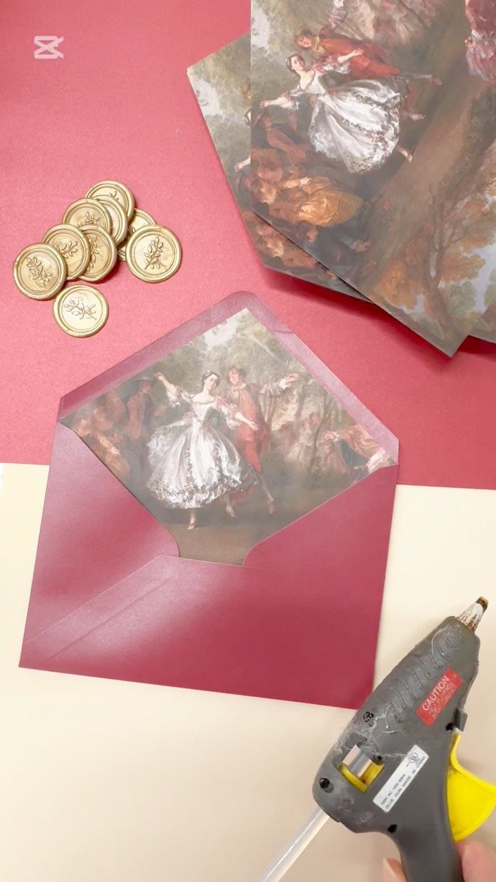
A liner is the cheapest place to spend on color, since it stays hidden until the flap lifts. A printed painting, like the classical one inside this burgundy envelope, gives a deep exterior a rich surprise.
Pick a liner that matches the envelope’s mood rather than competing with it.
Dark outside with a detailed print inside reads as formal. Gold seals on the flap tie the two together.
Glue it down evenly, and test one envelope before you commit to the whole batch.
2. Wax Seals
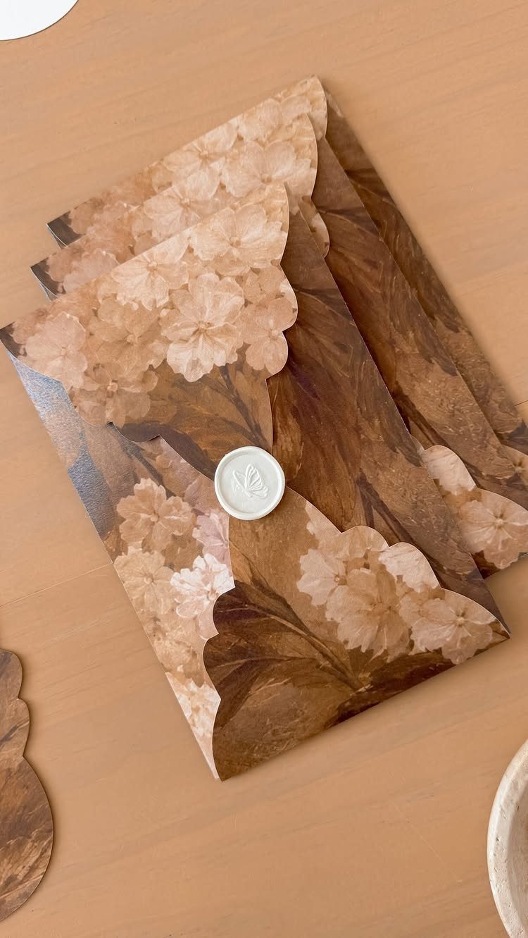
Contrast does the work here: pale wax against a dark, patterned flap catches the eye first.
A scalloped flap gives the seal a soft frame, so keep the wax small rather than large.
I would choose a single seal over several. It looks deliberate, and it keeps the stack of envelopes from feeling fussy.
3. Calligraphy Addressing
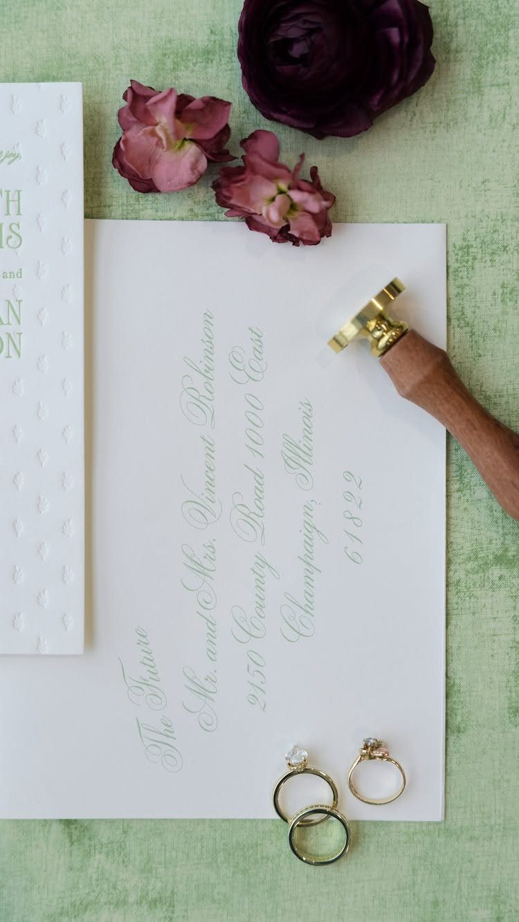
Hand lettering turns an address into the first thing a guest admires. On a plain white envelope, like the one addressed to Mr. and Mrs. Vincent Robinson, the script carries the whole design with no extra decoration.
Spending here makes sense if you keep everything else simple. Add a wax seal to the flap and you have a finished look without a crowded one.
Hiring a calligrapher costs more than printing, so ask about per-envelope pricing early, before you set the guest list.
4. Ribbon and Twine Wraps
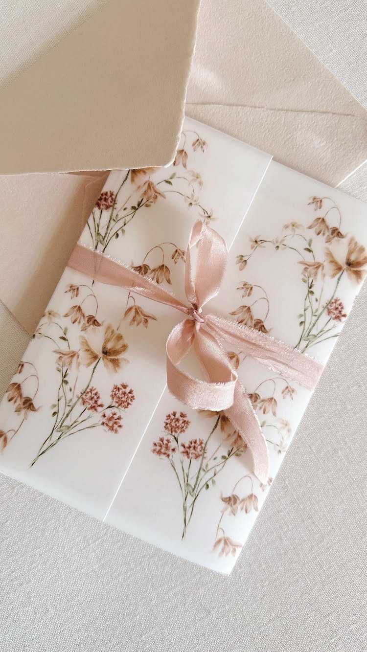
Soft ribbon changes how an invitation feels in the hand. A satin tie around a floral wrap adds texture that flat paper cannot.
Twine is the rougher, more casual alternative, and I would pick it for a relaxed venue. Satin suits a formal one.
Choose a ribbon color pulled from the invitation print so it looks planned. Tie each bow the same way, or the set will look uneven when it sits side by side.
5. Belly Bands
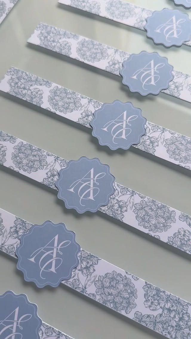
A belly band holds the suite together with one clean strip of paper, and it can carry a design of its own. A belly band gives you pattern without printing on the envelope itself.
Because the band wraps the invitation rather than the envelope, you can change its color without redoing anything else.
I like a monogram seal at the center, since it doubles as a closure and a small signature for the couple.
6. Envelope Sleeves with Cutouts
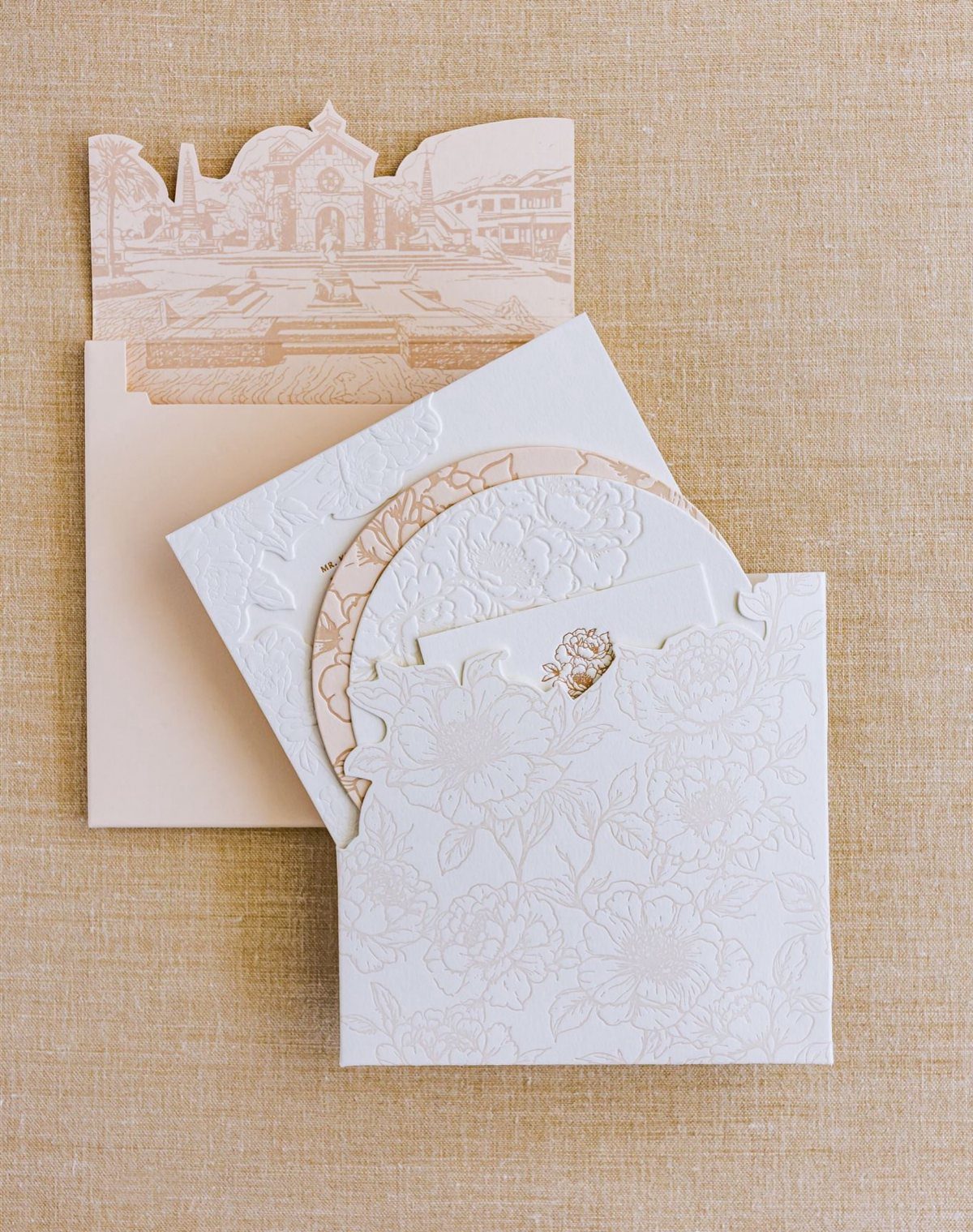
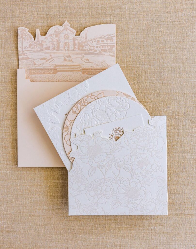
A laser-cut sleeve with a circular opening lets the card underneath show through, so the envelope becomes part of the invitation. White floral cutwork over a custom illustrated envelope gives you 2 layers to look at.
Expect this to cost more than a standard envelope, so I would reserve it for the main invitation and leave response cards simple.
Keep the card inside clean. The cutout is already busy, and it needs quiet behind it.
7. Bead Accents
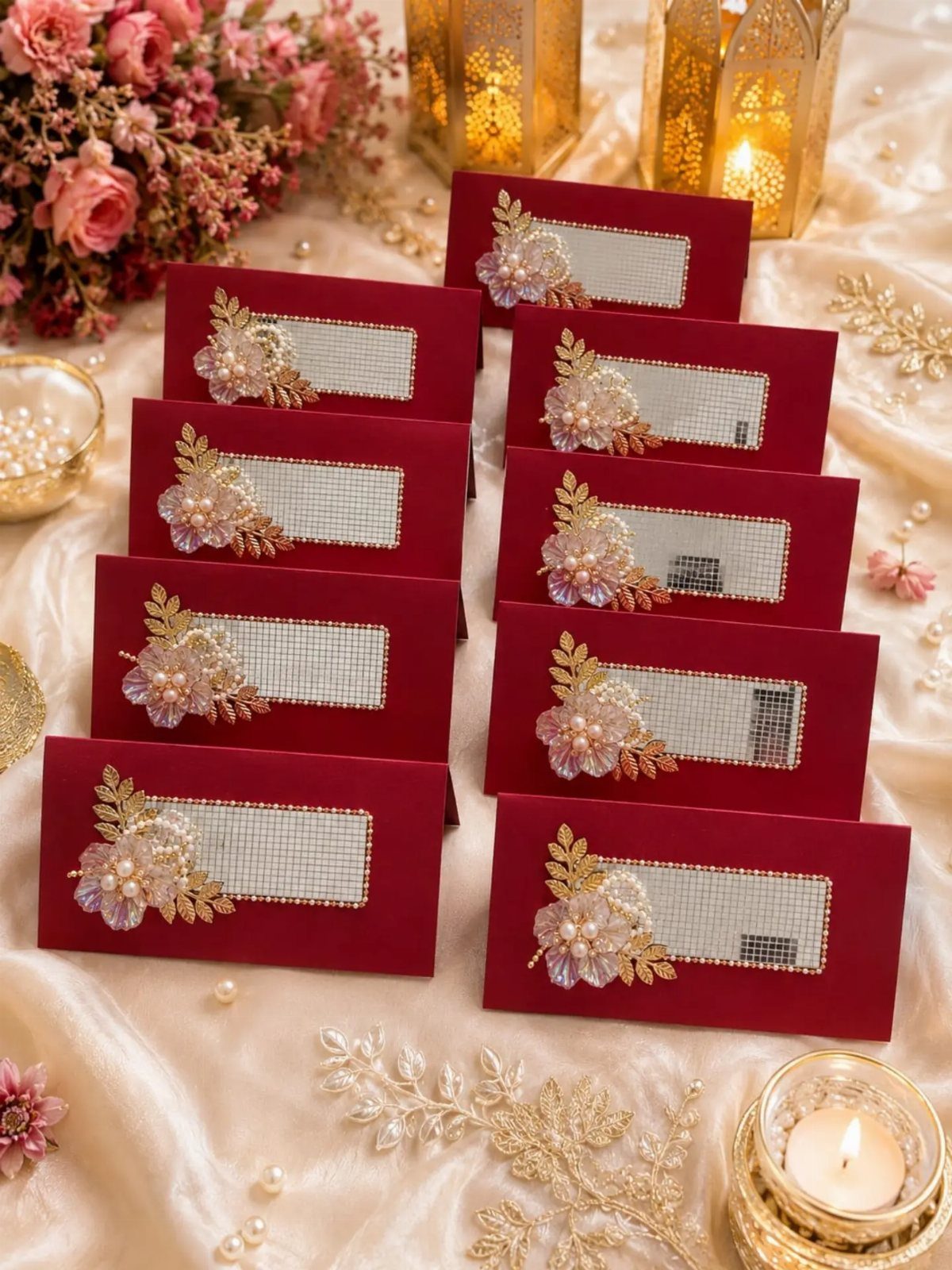
Small beads turn a plain red envelope into something guests will want to touch. Beadwork in a contrasting color gives weight to an otherwise plain insert.
Keep the beadwork to one spot per envelope. Dense color already does a lot, so I would let the beads carry the decoration and leave the rest of the surface bare.
Expect this to cost more than printing, since each piece takes handwork.
8. Colored Envelopes
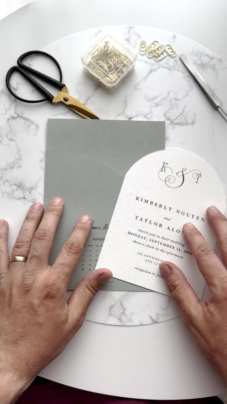
Sage green sets a calm, soft tone before anyone opens the flap. Against a white arched card, the color reads as fresh without turning loud.
Choose an envelope shade that sits a step away from the invitation, not a match for it. Grey or sage both let a white card stand out.
I would order one extra envelope to test the address ink, because dark ink and pale ink behave differently on color.
9. Vellum Wraps
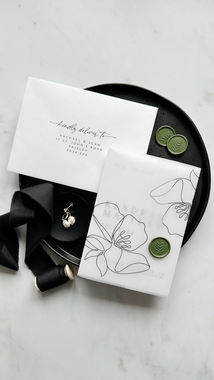
A vellum wrap holds all the pieces together without glue or clips. One translucent sheet wraps the invitation, details card and response card, and a line-art flower printed on it adds design without hiding what lies beneath.
A wax seal closes the wrap; add a ribbon when the suite is thick enough that the seal alone might slip.
I prefer this for suites with three or more pieces, where loose cards slide around. For a single card, it is more than you need.
10. Gold Foil Monogram Embossing
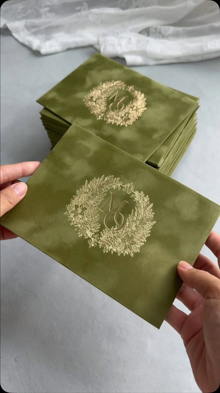
Foil on an olive green envelope gives you a monogram that glints in the light. A gold wreath with a single initial on the flap works as a crest, so the envelope needs nothing else.
Order the whole batch with the same design, so every flap matches when the stack lands on a guest’s doorstep.
Foil costs more than flat printing, and I think the flap is the right place to spend it, since it is the first thing seen.
11. Lace Trim Envelope Flaps
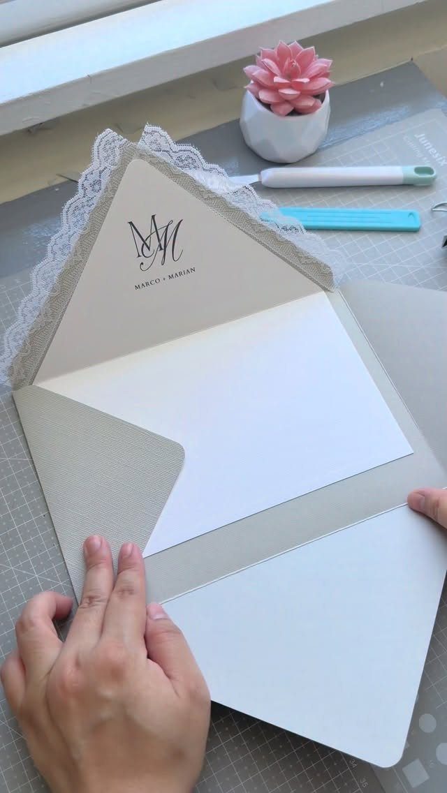
Lace along the edge of a flap gives a cream envelope a bridal softness that paper alone cannot. Keep the lace narrow and white so it frames the flap without overwhelming it.
A printed couple’s name, like the one on this envelope, sits well beside it when both are kept small.
I would glue the trim by hand in a single sitting, working through the stack together so the spacing stays even. It takes time, so it suits a smaller guest list best.
12. Floral Patterned Exterior Envelopes

A muted purple floral print across the whole envelope makes the outside the main decoration. Because the pattern is busy, I would keep the address clean and legible, and let it sit on a plain label or white space.
Ribbons and small monogrammed tags pick up the pattern’s pink and purple tones without adding clutter.
Choose a soft, low-contrast print over a bold one. It photographs well, and it will not clash with the card inside.
Practical Mailing Checks
Weigh one finished invitation with every card, liner, ribbon, and seal in place. Thickness and weight both affect postage, so a suite that feels light on the table can still cost more to mail than you planned.
Mail yourself one full invitation before you send the rest, using whatever service you plan to use for the real batch.
I would do this before ordering the full run, because swapping a ribbon, trimming the wax, or dropping a card is easy at 1 envelope and painful at 100.
If the test copy shows up creased or scuffed, you have learned that for the price of one stamp.
Addressing Is Part of the Design
Treat the address as part of the design, not an afterthought stamped on at the end. Match your addressing style to the invitation itself: hand lettering, printed labels, white ink on dark paper, or just a font that fits.
Ink color is worth a deliberate choice. Pastel metallics and deep dark shades both tend to work well, as long as they suit the envelope color.
Don’t forget the return address. It sits on the back flap, possibly right beside a wax seal, so check that the two don’t crowd each other.
Legibility comes first. If a decorative style makes the address hard to read, it can trip up postal systems and confuse guests, so I would pick the plainer option every time.