Formality picks the font before taste does, so a barn dinner and a ballroom evening should look different from the envelope onward.
The ideas here run from classic serif and calligraphy pairs to modern sans-serif options, with free resources listed at the end.
1. Pairing Wedding Fonts
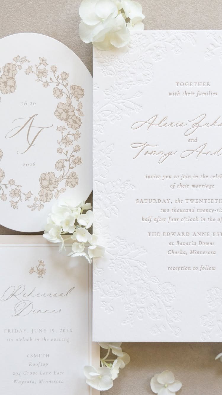
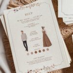
Script for the names, serif for the details: that split does the balancing work on a suite like this one.
The flowing letters carry the romance, and the plain serif keeps the date and the rehearsal dinner line easy to read.
Limit yourself to 2 typefaces across every card. A third starts to look like a ransom note, and a paired set costs nothing extra if your printer already offers both.
Keep the script large and the serif small, so they never compete for the same job.
Evelyn is another lovely wedding calligraphy font that combines classic calligraphy with a contemporary aesthetic. It includes 392 glyphs with plenty of discretionary ligatures, stylistic alternates, and contextual swashes.
2. Modern Wedding Fonts
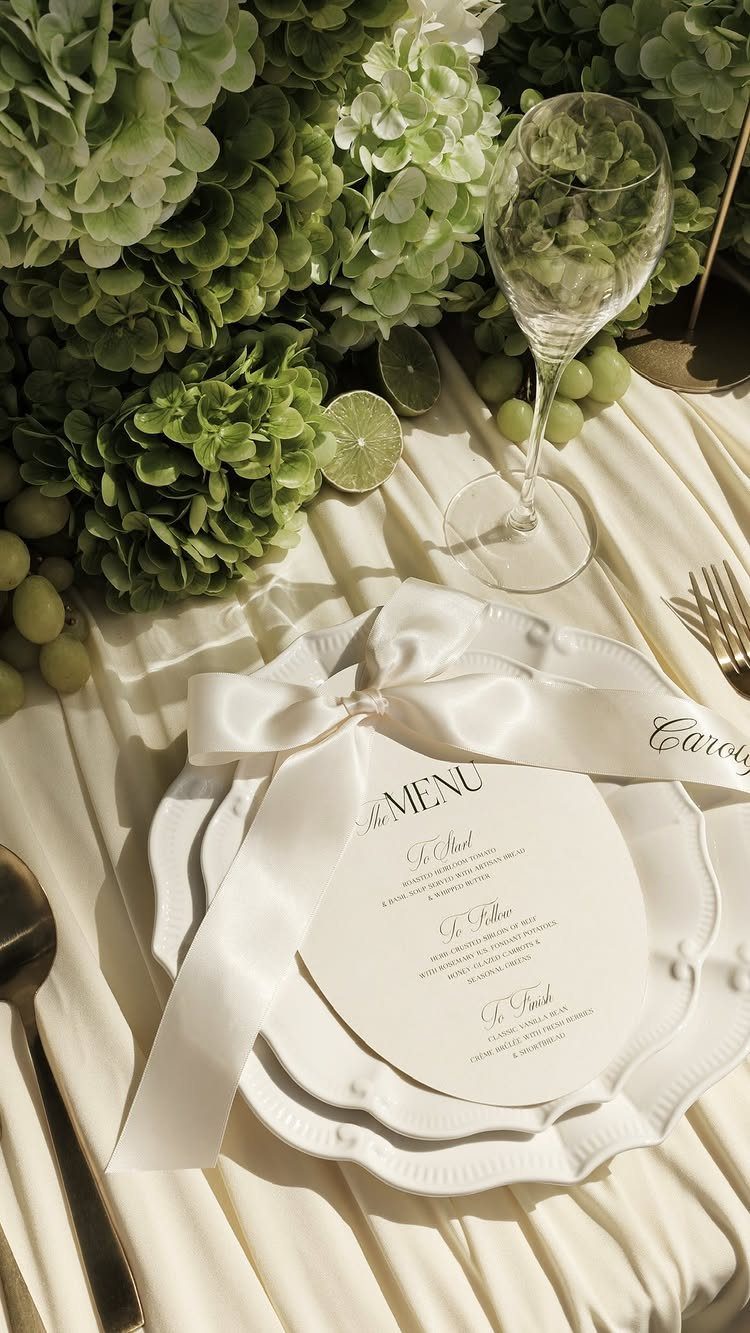
Clean, modern type suits a menu card better than almost anything, because guests read it while holding a fork. Spaced capitals for headings like "To Start" and "To Follow" give you structure without needing any decoration.
For a budget couple with little design experience, this is the forgiving option: fewer flourishes means fewer ways to get it wrong. I would pick one simple typeface and vary only the size.
The maker of this piece notes that satin ribbon, lace, or layered place settings make the type read as a delicate statement on the table.
3. Cursive Script Wedding Stationery
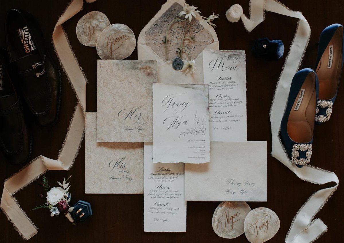
Cursive script works best in small doses.
Keep long blocks of cursive off your invitations. Addresses, times, and directions are where guests squint, so set those in a plainer face.
I like script most when the letters are loose and slightly uneven, since that reads as handwritten rather than typed. Print a test copy before you order, and read it from arm’s length.
4. Calligraphy and Serif Combinations
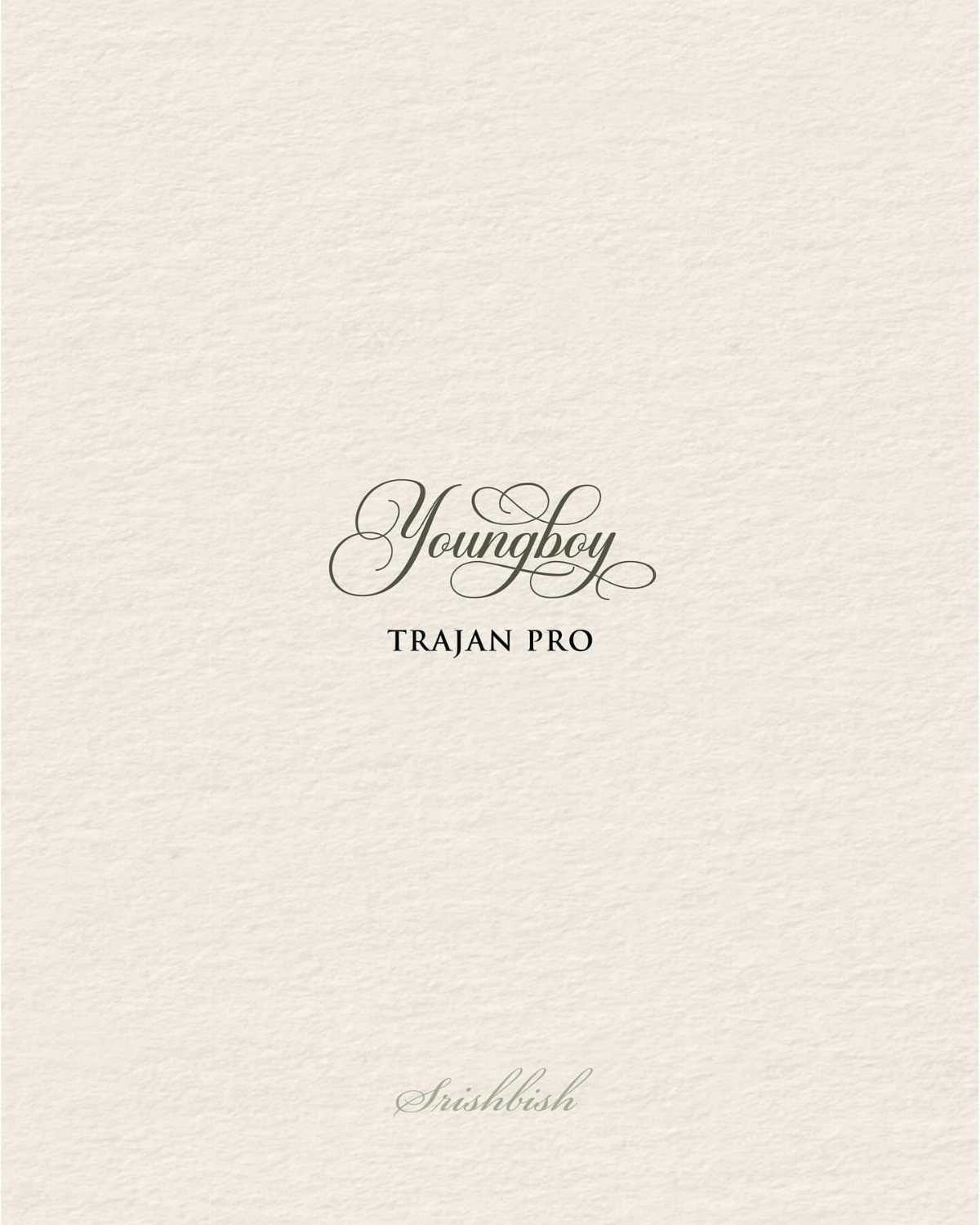
Trajan Pro is a capitals-only serif with a calm, carved look, and it sits well beside a calligraphy name.
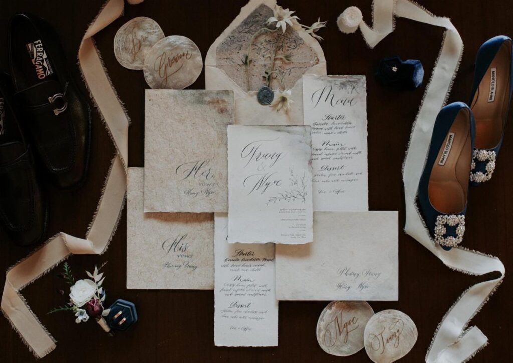
Printing a sample on textured, off-white paper, as here, shows you how both fonts behave on the stock you will actually use.
Let the calligraphy handle one thing, usually the couple’s names, and give Trajan the dates and venue. A small second script at the bottom, like the sample, can sign off the card.
Order a paper sample before committing, since texture can swallow thin script strokes.
Choosing the Right Font
Formality should set the font, so settle that first and let the pretty letterforms wait their turn. A barn dinner and a ballroom evening call for different type, and guests should sense that from the envelope alone.
Legibility comes first, and a quick test settles it: print the card at actual size and read the smallest line from arm’s length. If you hesitate over a single word, that font loses.
Free fonts are plentiful, and a long list of options is the real hazard, since it eats evenings.
Pick 3 finalists, set your names and date in each, and choose the one that still looks right once the text is no longer the pretty part.
Fonts also need to get along with each other. If two faces seem to argue on the page, swap one out before you worry about anything else.
Font Resources
Google Fonts is my first stop: its open-source library runs past 1000 families, and each one downloads in a single click.
A library like that can cover your invitations, programs, and thank-you cards at no cost, which matters a lot on a small budget.
DaFont lists over 34,000 downloads sorted by category, which makes it good for hunting a theme, such as script or decorative. Check the license on each font, since some are free only for personal use.
If you spot a font on a card you love, upload a photo of it to What The Font. It names the font or suggests close matches.
Canva is the easiest route if you have no design experience, because its templates cover everything from invitations to thank-you cards. Adobe Fonts comes with Adobe Creative Cloud, so it makes sense mainly if you already pay for that.
Font Aesthetics
Let the paper decide how bold the type should be. Thin hairlines vanish on rough stock, and a heavier face holds up better there.
Color works the same way. Pale ink on cream paper looks soft in a mockup but can turn muddy in print, so test the contrast first and decide after.
A sturdy serif such as Playfair Display suits large headers and formal layouts, and it keeps a delicate script from drifting off the page.
Run a test copy on plain office paper before sending anything to the printer. It costs pennies, and it can spare you the price of ruined cardstock.
Frequently Asked Questions
What is the most elegant font for a wedding invitation?
Bickham Script Pro and Alex Brush are often called elegant. Deluce runs all-caps with squared-off rounds and minimal thick-thin contrast, making it a good pick when you want modern without ornament.
Whichever you pick, a sturdy serif such as Trajan Pro for the details keeps a fancy name line easy to read.
How do I design a wedding card using Microsoft Word?
Start from a template and swap in fonts that match your wedding style.
Keep it to 2 typefaces, a script for the names and a plain serif for the details, and print a test copy on office paper before you order cardstock.
That test costs pennies and shows you whether the smallest line reads from arm’s length.
What is the 3 font rule?
Some designers cap a design at three fonts, but I would stay at two on a wedding card.
What’s the most romantic font?
Great Vibes and Adios Script Pro are often named the most romantic.
Loose, slightly uneven script reads as handwritten, which adds to the feel. Use it in small doses, such as the couple’s names, and set times, addresses, and directions in a plainer face.