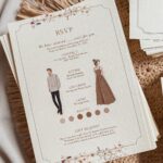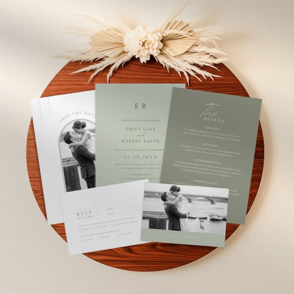
Your venue decides which sage green belongs on the card: olive and eucalyptus shades suit a vineyard, while a lake or seaside setting calls for blue-leaning greens like teal and seafoam.
The 7 ideas run from a minimalist card with one metallic and a single small illustration to gold foil, wax seals, and translucent vellum wraps.
Order a printed proof and hold it next to your table linens to see whether the green holds up on paper.
1. Minimalistic Sage Green Wedding Invitations
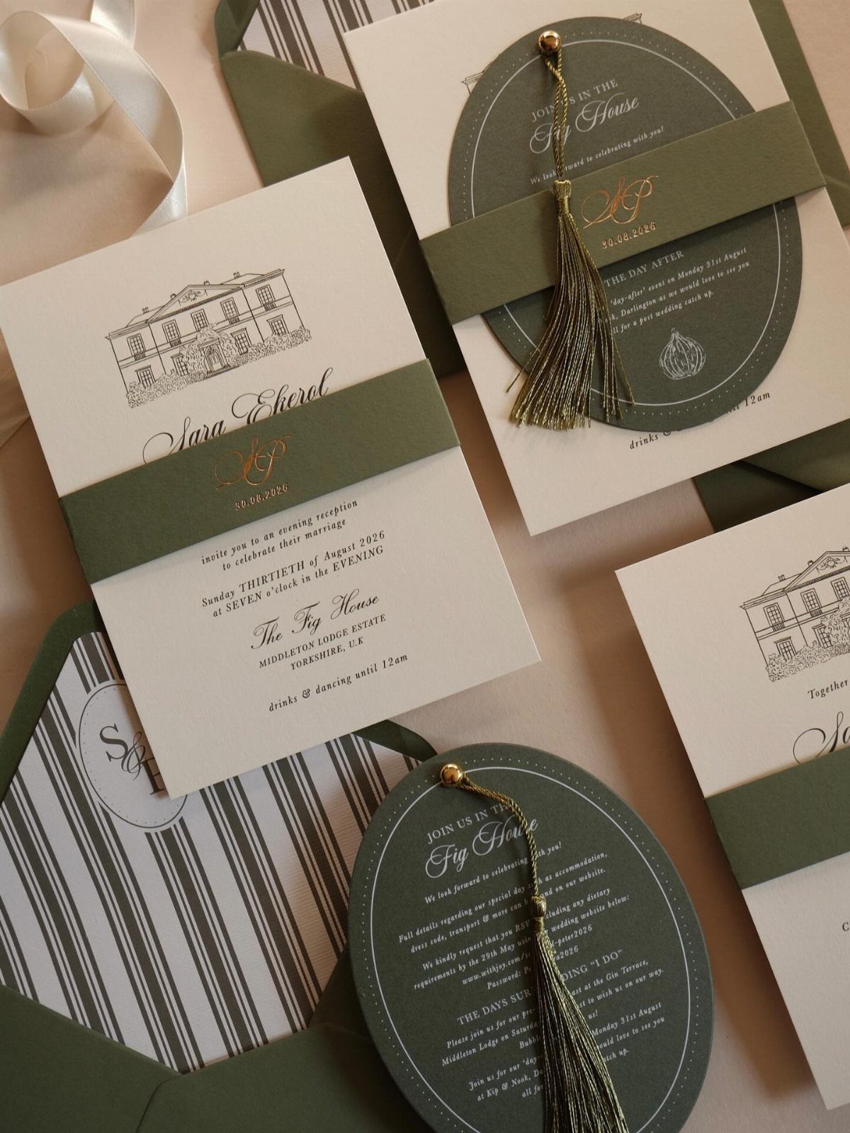
Restraint does the work here. One sage green, one metallic, and plenty of blank space around a single small illustration keep the card calm, and I would pick this over a busy suite when the budget is tight.
Gold calligraphy for the names and a plain tassel or ribbon is enough decoration. Let the type carry the card, and skip extra borders.
Pairing cream with the green keeps it soft instead of stark.
2. Botanical Wedding Invitations
A botanical card works best when the plants are part of the layout, not stuck on as an afterthought. Pick one or two stems and let them frame the text.
I would keep the printed foliage in sage tones and let the flowers supply the white.
3. Rustic Wedding Invites
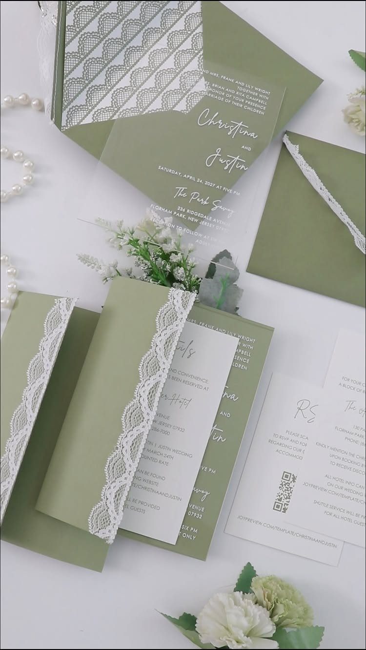
Outdoor weddings call for invitations that look like they belong on a table under trees. Lace trim on an envelope does that quietly, and white lace against sage reads soft, not country-kitschy.
A clear acrylic card is the modern twist I like most here, since it keeps the rustic feel from turning heavy. Add small white flowers or pearls only if you are photographing the suite; they will not survive the mail.
4. Gold Foil Wedding Invitations
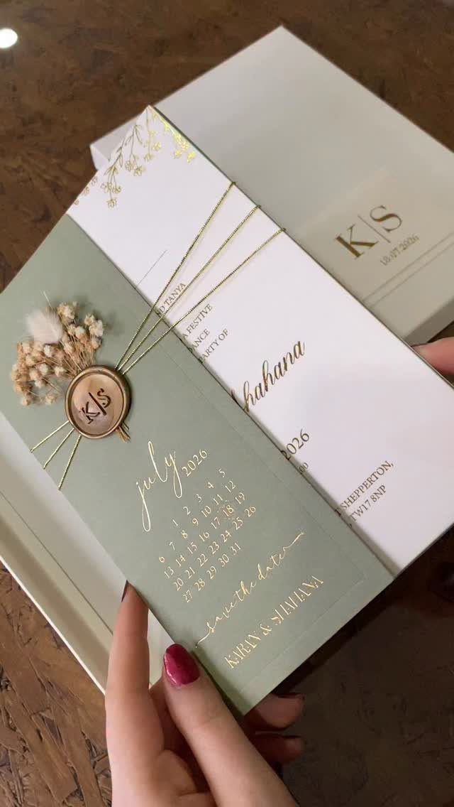
Foil is where I would spend money if I could spend it in only one place. Gold on sage reads richer than ink, and it catches light the way plain printing cannot.
Keep the foil to the details that matter: the names, the date, a small seal. Too much and the green disappears.
Foil costs more than flat printing, so ask your printer for a quote before you fall for a design, and consider foiling only the front card.
5. Matching Day-of Stationery
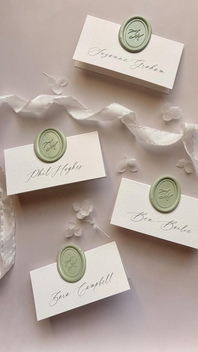
Place cards are the cheapest way to make the invitation echo across the reception. Cursive names in the same script as the invite, with a sage green wax seal on each, make the table feel planned.
Use one ribbon color and one seal color throughout, and repeat them on programs and menus.
Write names legibly, since guests read these at a glance while hunting for a seat.
6. Translucent Vellum Wraps
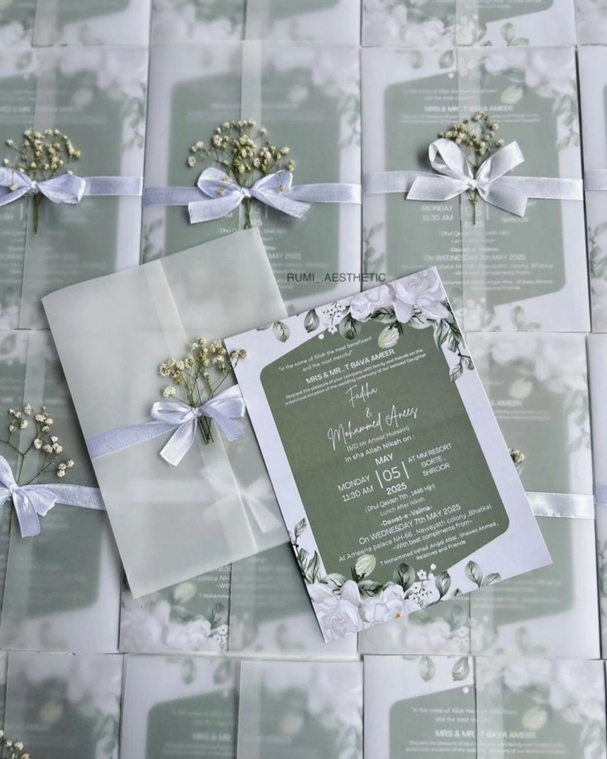
Vellum turns a flat card into something you unwrap. A translucent sheet over a floral sage invitation softens the print underneath, and a thin white ribbon holds it closed.
A small sprig of baby’s breath tucked into the knot is the finishing touch I like best. It is also the one piece to skip for mailing, since a dried sprig can crush; add it for hand delivery instead.
7. Wax Seal Accents
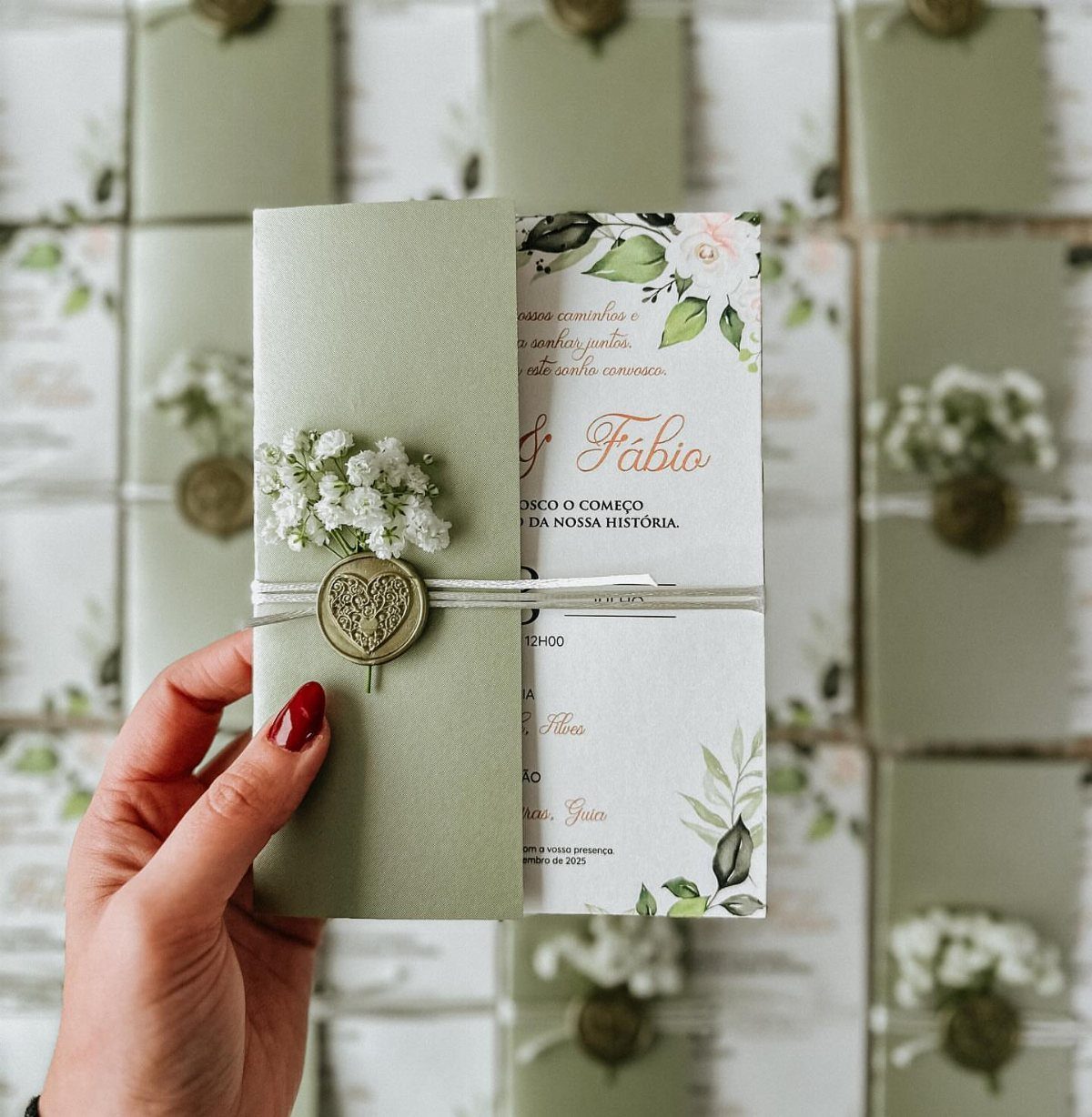
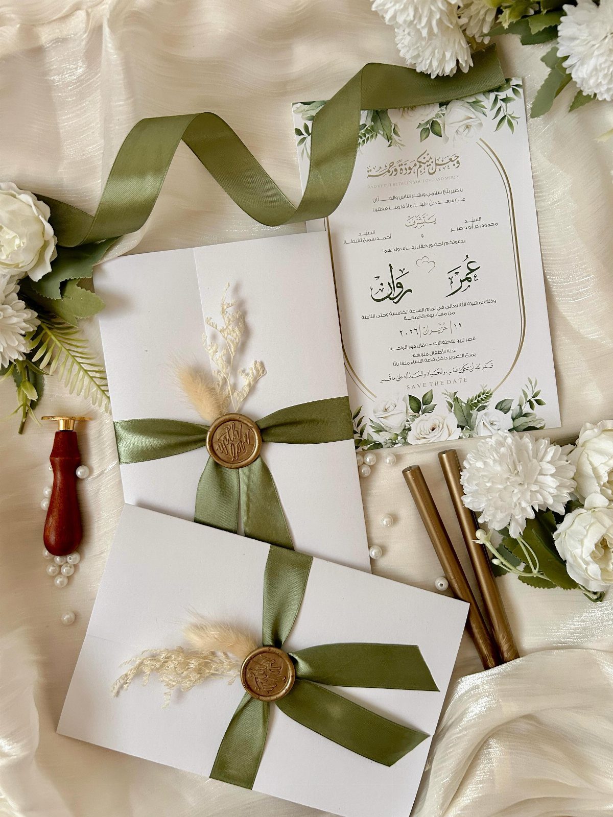
A gold wax seal gives a sage card a small, tactile finish, and a heart-shaped one reads warmer than a plain round stamp.
Gold against the green looks rich without the cost of foil, which makes it my pick for a tight budget.
Pair the seal with a ribbon and a few sprigs of baby’s breath, and keep the ribbon to one color so the seal stays the focus.
Custom seals can carry your initials or a motif that matches the rest of the suite.
Raised wax can snag in the mail, so I would seal the invitations you hand deliver and use a flat sticker seal on the rest.
Tips for Choosing Invitations
Start with the venue, because it tells you which green to order.
Olive and eucalyptus shades suit a vineyard, while a lake or seaside setting calls for the blue-leaning greens: teal, seafoam, turquoise and aquamarine. A watercolor design echoes sea glass and water better than a crisp graphic print.
Match the card to the palette you have already committed to, not to a pretty sample you saw first.
Hold a swatch of your bridesmaid dresses or table linens next to the proof, since screens flatter green and paper often prints it grayer or yellower.
A botanical garden or a flower-heavy reception can take bolder leaf and succulent designs. A backyard wedding usually suits something simpler and more intimate.
Common Mistakes to Avoid
3 mistakes cause most of the regret: poor timing, bad design and typos. Each one is cheap to prevent and expensive to fix after printing.
For timing, work backward from your mailing date and build in time for proofs and a reprint. A rush fee on a late order can wipe out the savings you found elsewhere.
For design, check legibility before beauty. Pale script on a sage background can vanish, so print a test copy at actual size and read it from arm’s length.
For typos, proofread the names, date, time and address, then ask someone else to read through them. I would also read the details aloud, backward, one line at a time, because your eyes skip what they already know.