The list runs from a patterned liner and a wax seal, which cost little, to custom die-cut shapes and hand-illustrated florals, which need a quote or a commission.
What decides your pick is how much of the invitation suite you can afford to make special: if the budget is tight, one detail like a patterned liner carries more than a whole suite of small extras.
Choose the single piece guests will touch first, and keep everything else plain around it.
1. Bold Color Palettes
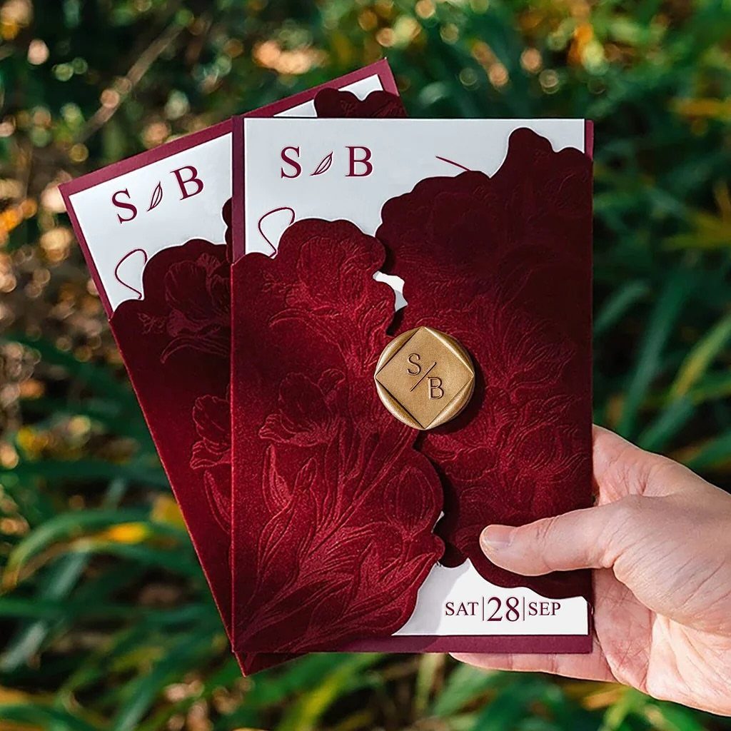
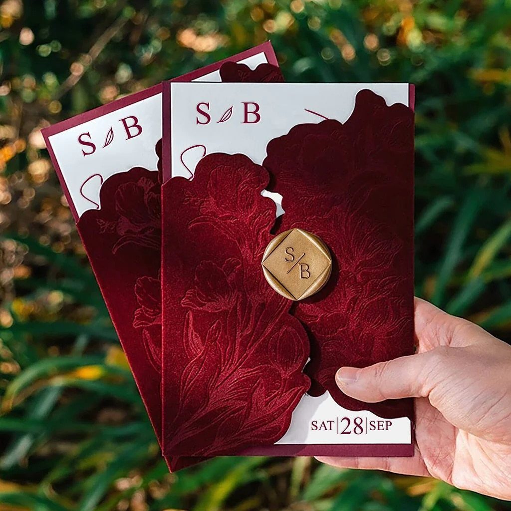
Deep burgundy with gold is a pairing I would pick over blush any day, because the contrast does the work before a single word is read.
Velvet-look paper and a gold wax seal push the richness further, and green outdoor settings make the red look even deeper.
Keep the rest of the suite quiet. One saturated color, one metallic accent, and plenty of white space on the inner cards will keep it from feeling heavy.
2. Editorial Wedding Photography
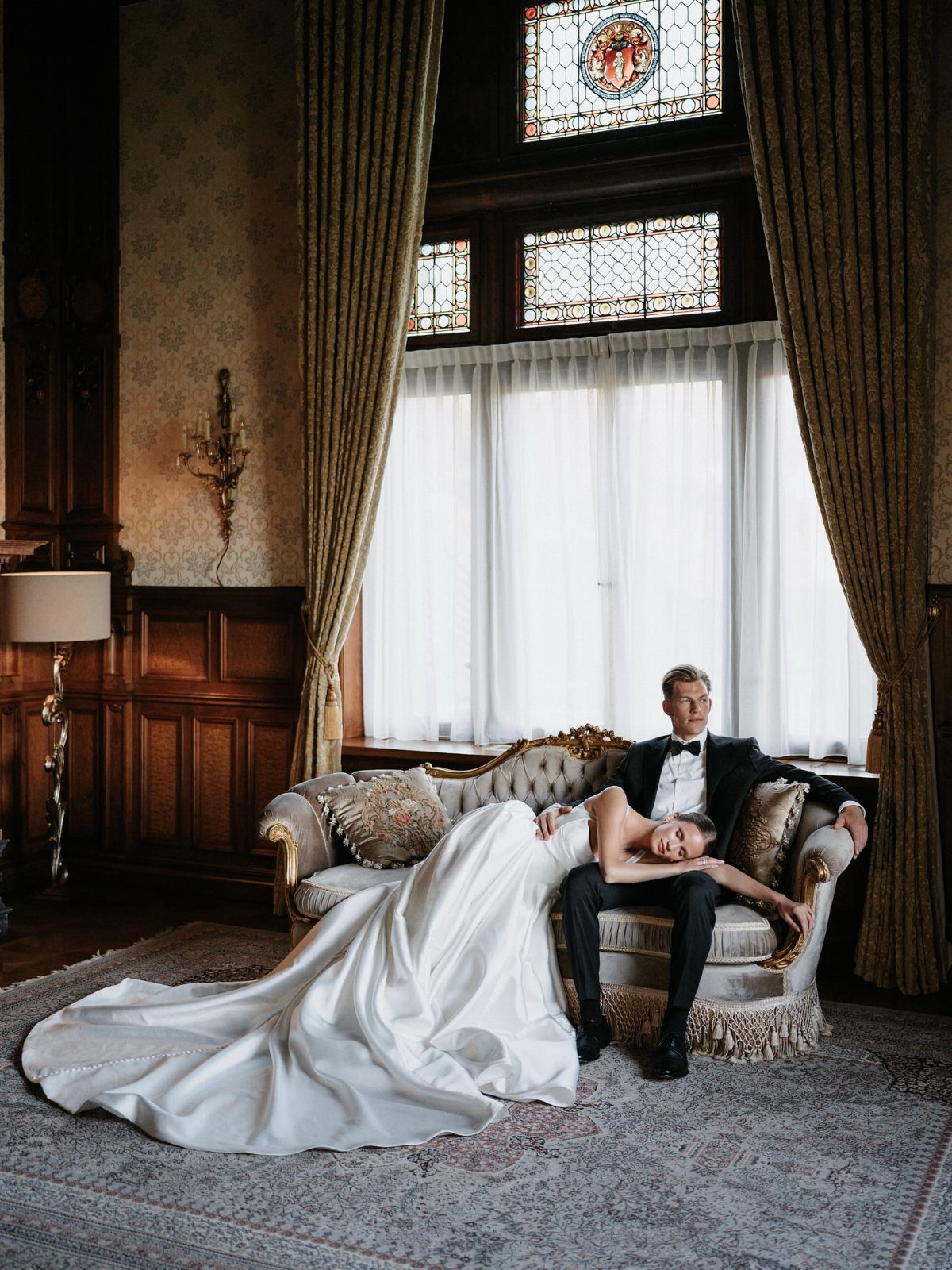
Posed like a magazine spread, a couple on a vintage sofa in a wood-paneled room reads as fashion first and wedding second.
That is the look I would ask a photographer for if the venue has character, since the room itself becomes the backdrop.
Look through a photographer’s full galleries, not just the highlights, and ask how they balance posed frames with candid ones. Budget a little extra time for the portraits, because editorial shots take longer to set up and compose.
3. Hand-Illustrated Florals and Botanicals
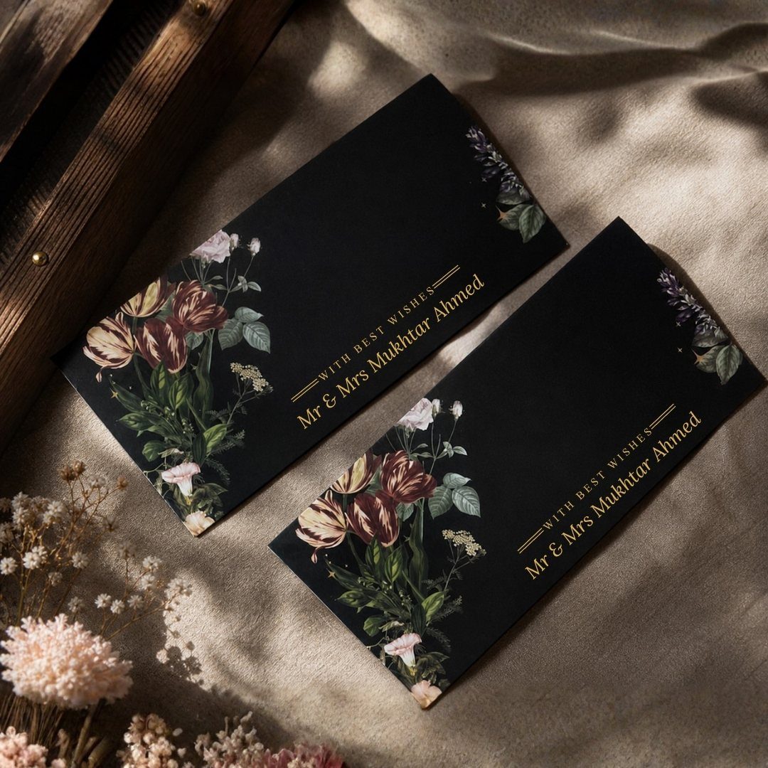
Hand-drawn flowers in gold on black paper feel more personal than any stock floral pattern.
The artist’s line work gives the invitation a one-of-a-kind quality, and I like it best when the illustration carries the design so the wording can stay simple.
Ask an illustrator whether the drawing can be reused on envelopes, programs, or a monogram. That stretches one commission across the whole suite.
4. Custom Die-Cut Shapes
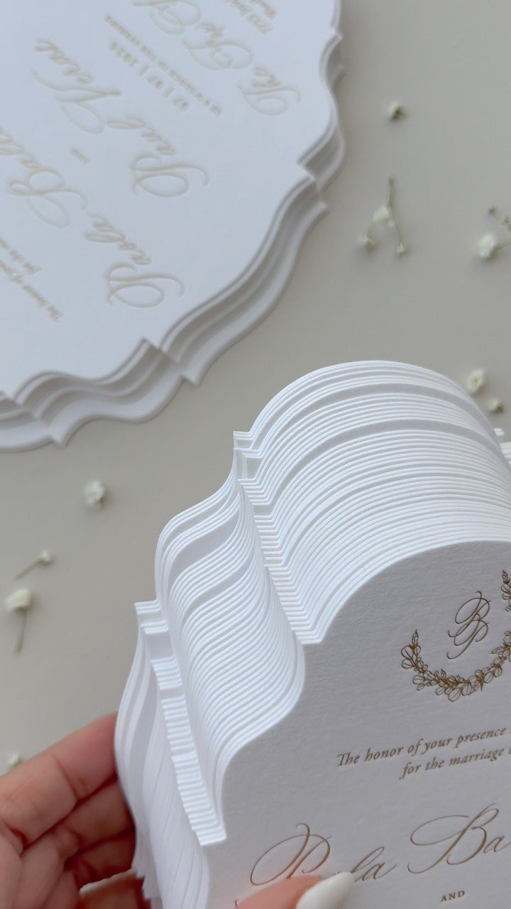
A scalloped edge is the gentlest way to leave the plain rectangle behind.
It reads as soft and formal at once, especially in white with gold cursive, and I would choose it over a wilder shape if guests will be handling the cards a lot.
Custom cutting usually costs more than a standard trim, so ask for a quote before you fall for a shape. Simple curves are the easiest to get right.
5. Patterned Liners and Wax Seals
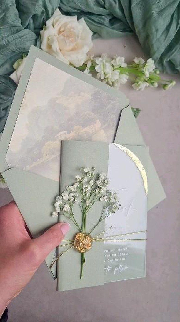
Open the envelope and the liner should be the surprise. A cloud-patterned liner against sage green gives guests a small moment of delight, and a gold wax seal closes it with a flourish.
If the budget is tight, I would put the money into the liner and use a simple sticker-style seal. The pattern is what people see first and remember.
6. Wedding Branding
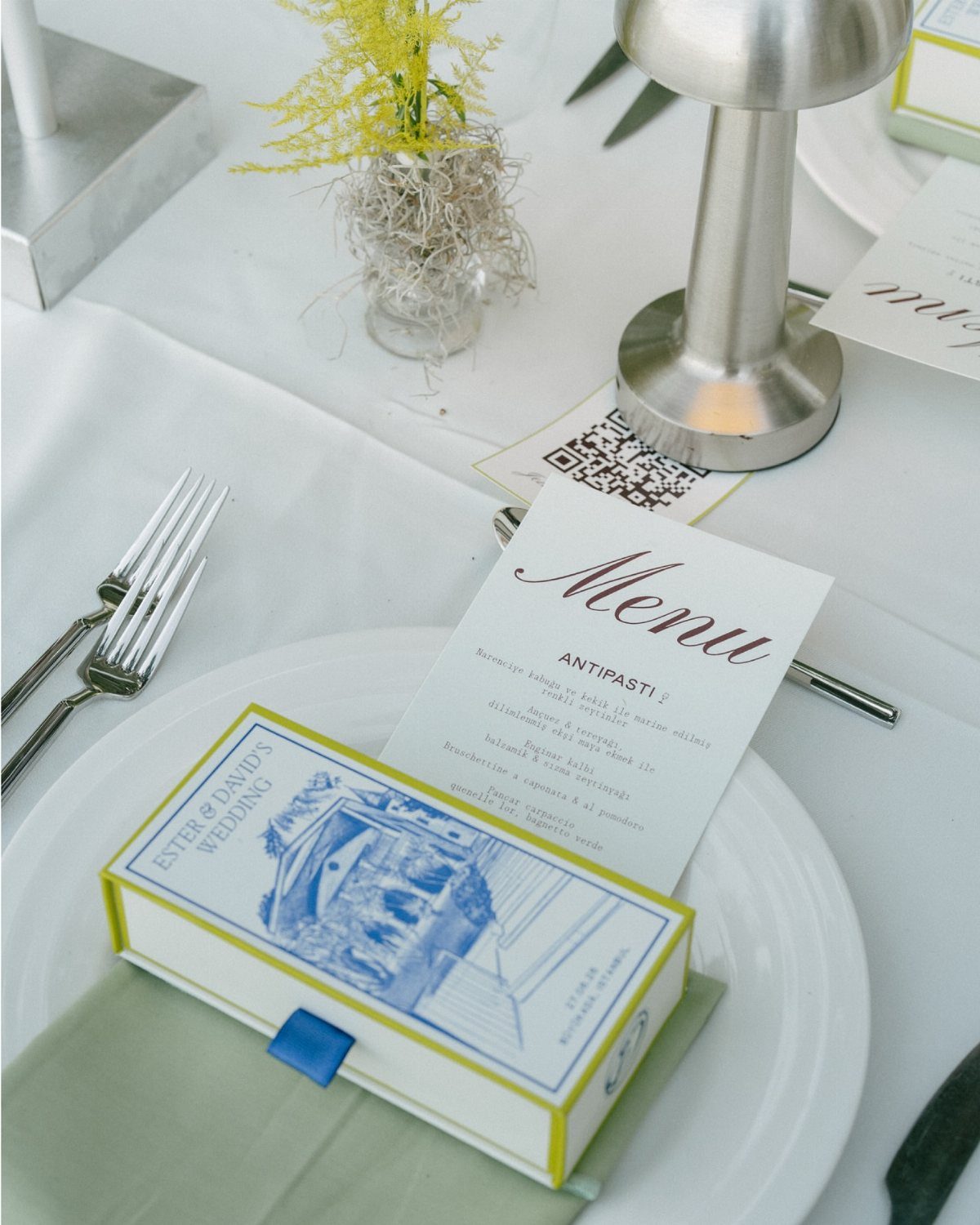
A favor box printed with the couple’s names, a menu in matching type, and a napkin in a coordinating green: together they make a wedding read as one design.
I think a shared name treatment and two or three repeated colors are enough to pull it off.
Choose the look before ordering anything, then apply it to the smaller pieces first, like menus and favor boxes, where printing is least expensive.
7. Antique Lace
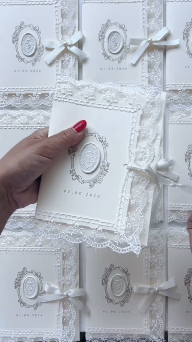
Lace trim on a white invitation brings texture that flat printing cannot match, and a wax seal with a ribbon keeps the whole thing from tipping into fussy.
I like it for couples who want something nostalgic without a vintage theme running through everything else.
Keep the wording and the rest of the suite plain so the lace stays the one soft detail. A stack of identical cards will show any uneven trim, so check one finished sample before you commit to the full order.
8. Vellum Wraps and Translucent Overlays
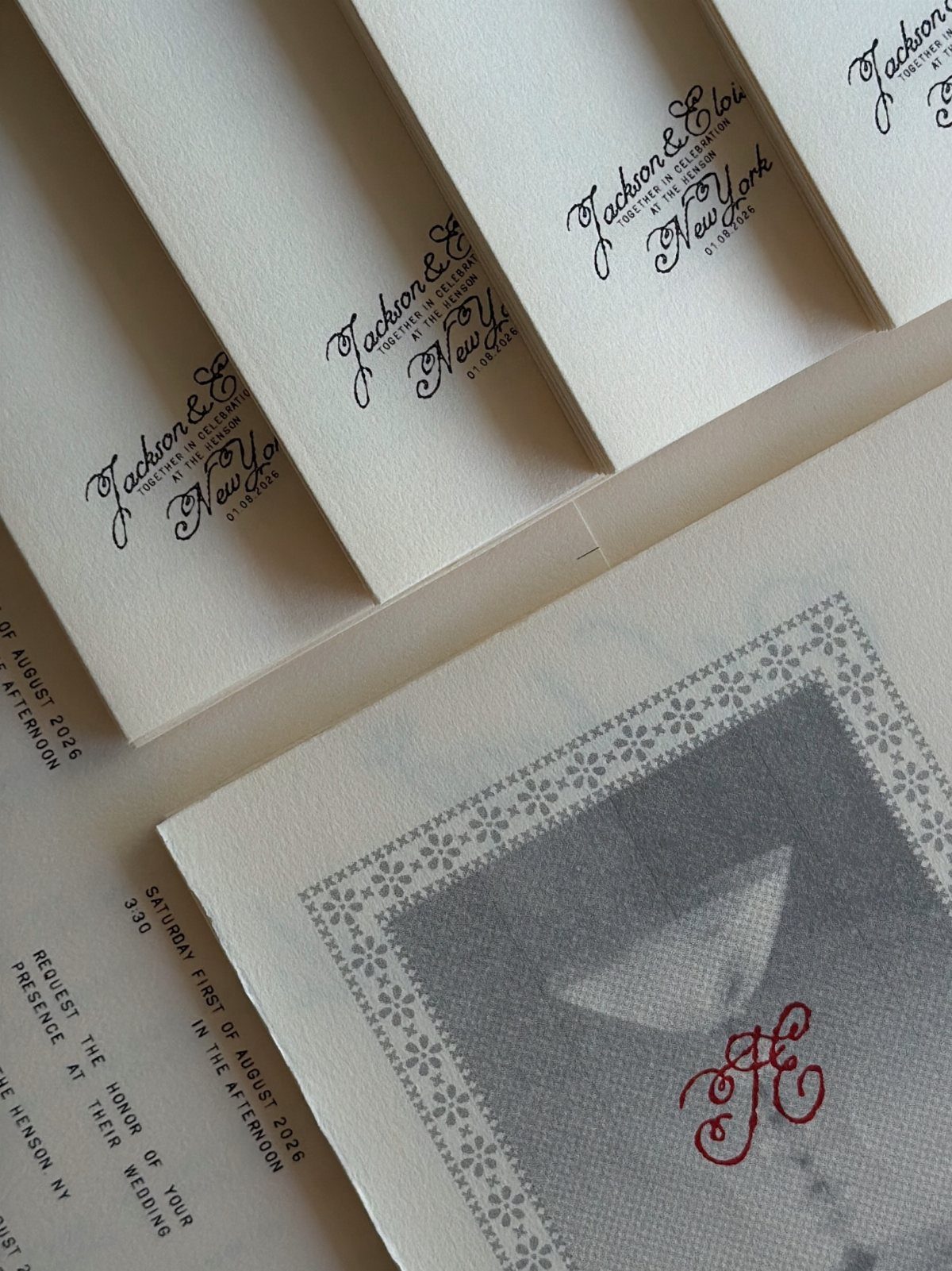
A vellum wrap lets guests see a card before they touch it, and that small tease is why I would choose it over a solid envelope.
Names printed on the translucent layer, with a monogram card underneath, give you two levels of design from one piece.
Make sure the text on the vellum does not collide with what sits beneath it. Ask your printer to proof the layers stacked together, since a see-through sheet shows everything behind it.
9. Custom Maps and Venue Illustrations
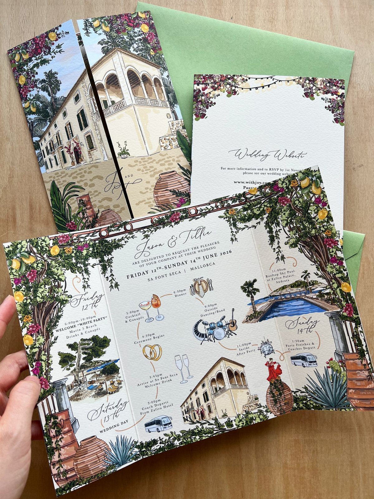
An illustrated map does 2 jobs: it tells guests where to go and shows off the place itself.
For a destination wedding like a villa weekend, I would draw the buildings, the lemon trees and the paths, then add a simple itinerary on the next page.
Hand the illustrator a clear list of landmarks guests actually need, such as the ceremony spot and the parking area. Decoration is easy to add later, but a missing landmark confuses people.
10. Espresso Bars and Live Musicians
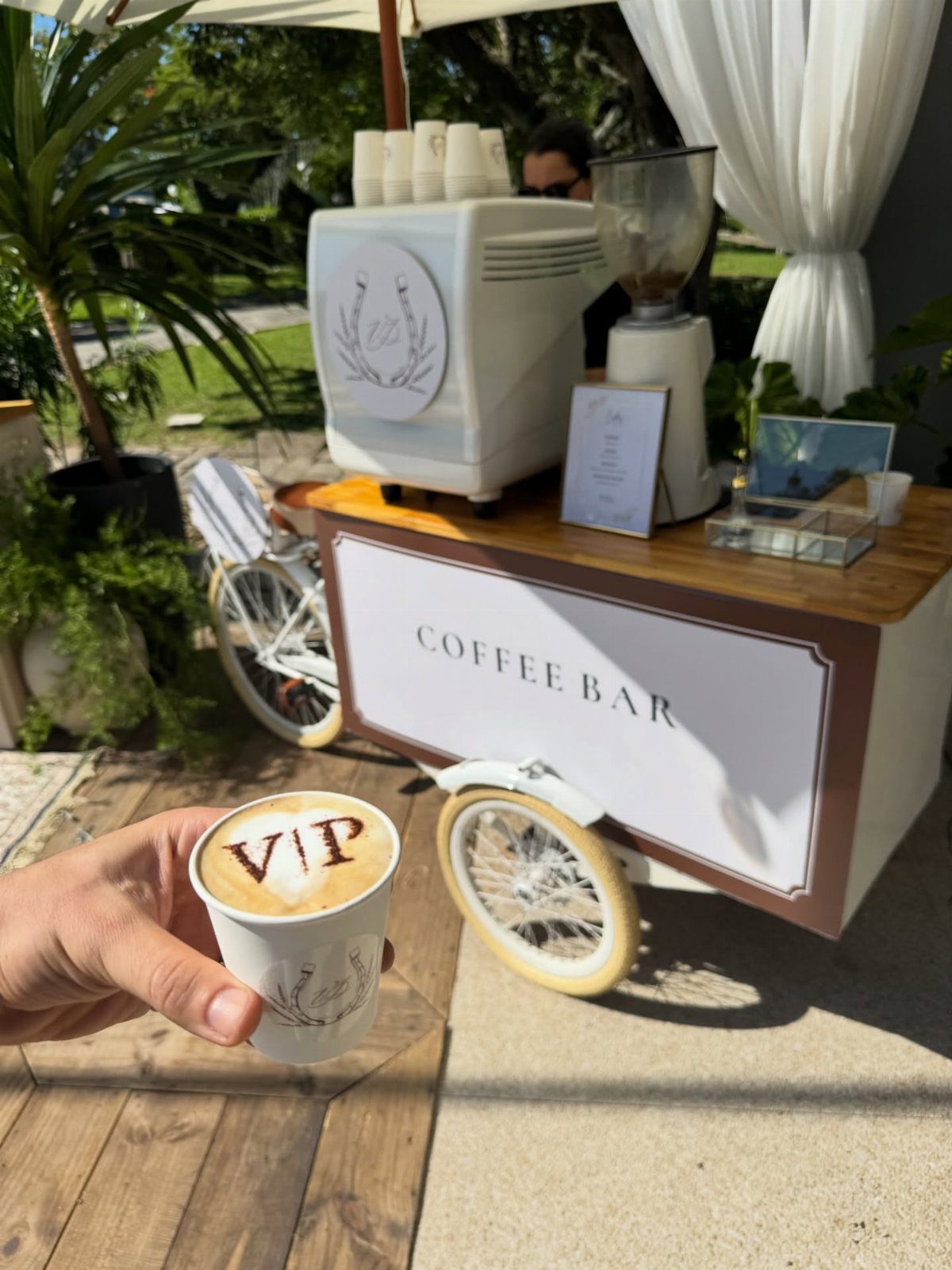
A mobile coffee bar with a real espresso machine and grinder gives guests something to do between ceremony and dinner.
I love the custom foam art on the drinks, since a name or a "VIP" on top costs almost nothing extra and feels personal.
Plan the setup near the cocktail hour, in shade if you are outdoors. Live musicians pair well with it, but treat them as a separate booking and ask each vendor what space and power they need.
11. Handwritten Notes and Printed Keepsakes
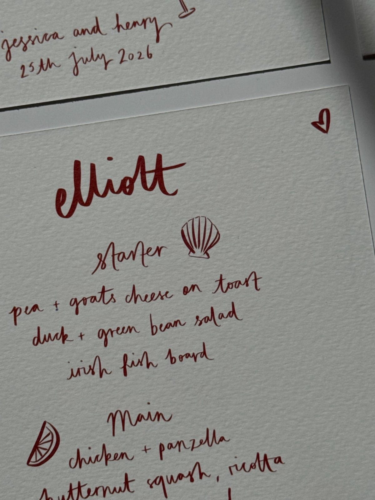
A handwritten menu or program brings back the feel of a note someone actually wrote, and red or dark ink on textured paper reads cleaner than pencil or light gray.
Doodles beside the courses make it looser, and I would pick this over fancy type if the dinner is meant to feel relaxed.
Hire a calligrapher or write it yourself, then have it scanned and printed so every guest gets a copy. Keep the courses short, because handwriting takes more room than typeset lines.
12. Formal Typography
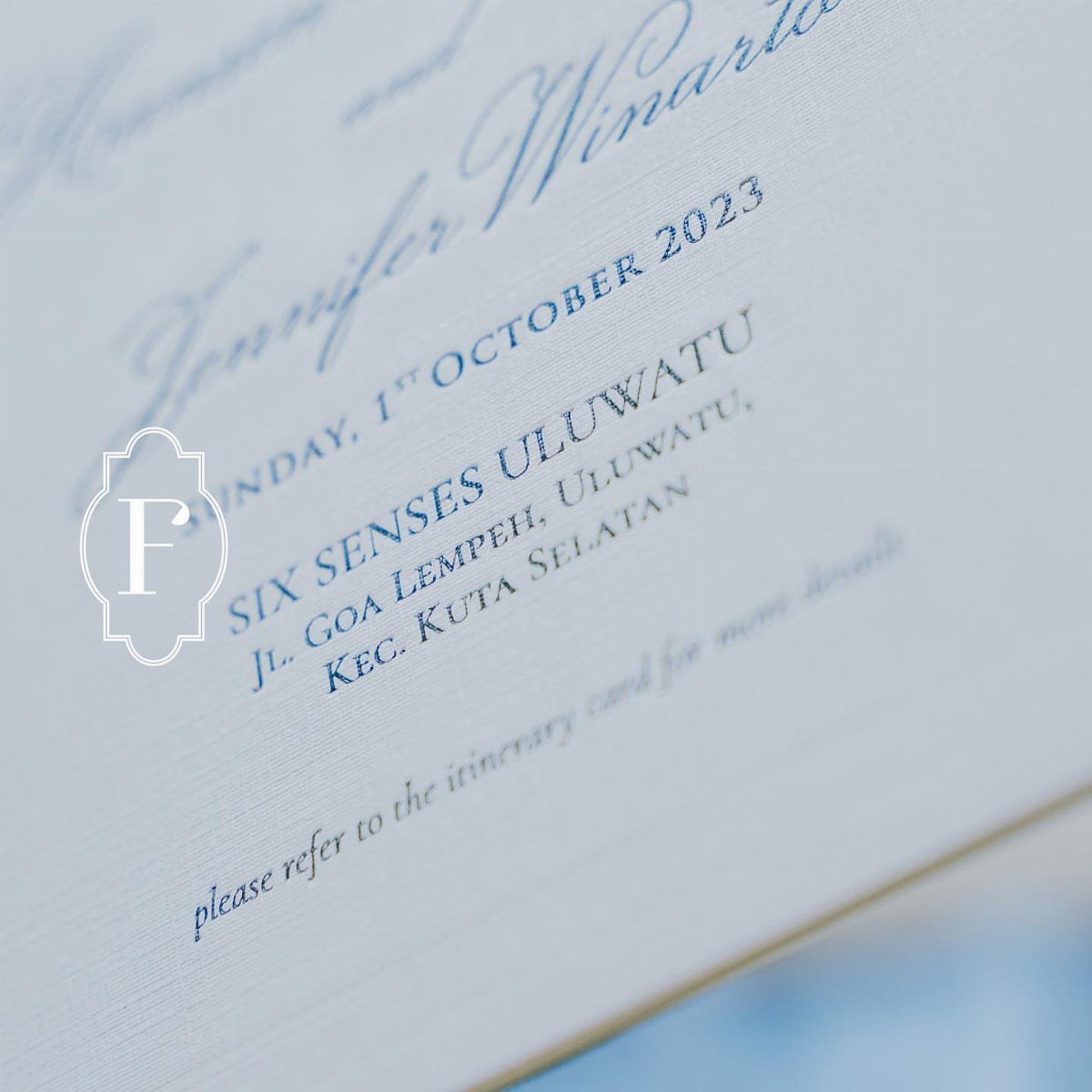
Blue type on white, a spelled-out date, and a small crest with a monogram: this is formal done with restraint.
I would choose it over script every time, because capital letters with generous spacing read as confident and are easy to read.
Use one typeface for the details and keep the crest small. Put the venue name on its own line so guests spot where to go at a glance.
13. Playful Wedding Stationery Featuring Doodles
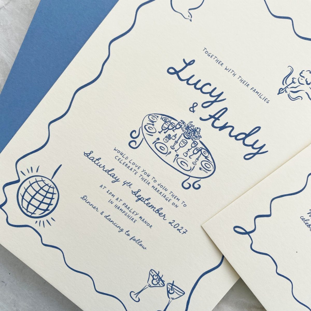
I would choose this over a formal suite for a couple who want the invitation to sound like them, and blue line art on white keeps it playful without looking messy.
Pick two or three doodles that stand for your actual wedding, then repeat them on the save the date, menu and place cards. The same little drawings across the pieces are what make it feel planned rather than random.
Keep the date and venue in clear, plain lettering so the fun stays in the drawings.
Inspired by the charm of an artist’s sketchbook, scribble-style invitations bring a sense of expressive, hand-touched beauty to wedding stationery. This trend leans into whimsical, simple linework that feels elegant but spare and refined without trying too hard.
Focus on Personalization
A wedding built around your own story starts with picking one or two signature elements, not theming every corner.
A single strong idea carried through a welcome sign or a photo wall reads clearer than 10 small personal touches scattered around the room.
Structure is the other place to personalize, and it costs less than decor.
Decide what you want guests to feel at each stage, then build the schedule around that. Tell your venue and vendors early, since a changed order affects catering and music timing.
Sustainability in Weddings
Sustainability has gone mainstream, and the easiest wins are also the cheapest. Order what’s in season, move the ceremony arrangements to the tables for dinner, and rent anything that gets used more than once like uplighting or fabric backdrops.
Recycled cotton stock, handmade paper and soy ink have moved from the eco-conscious niche into high-end stationery.
Seed paper invitations can be planted after the wedding and will grow into wildflowers, which makes them my first choice if you want a sustainable option that does something.
Sustainable materials do not cost you design options.
For favors, seed packets beat plastic trinkets. For centerpieces, potted plants and dried blooms last longer than cut flowers.
Experience-Driven Celebrations
Guests remember how the night felt, not what they carried home. That is why I would move favor money into experiences.
Good options include a cannoli station, late-night snacks, interactive food displays, a photo booth and a cozy lounge space.
Choose one or two, not all of them. A lounge and a late-night snack, for example, give guests more to talk about than a table of favors ever will.
Add a themed photo area if you want a cheap story-driven touch, such as a vintage vignette or a bohemian lounge corner.
Frequently Asked Questions
What is the biggest wedding invitation trend in 2026?
Plenty of white space and a type-first layout set the tone this year, usually with a single bold color doing the only decorating.
Spaced-out capitals also scan quickly and look sure of themselves, which is why I like them on the formal suites.
Are traditional wedding invitations still popular?
Yes, though designers are reworking the classic format instead of abandoning it.
Formal wording and flat cards stay, while texture, modern typography and personal touches change how they look. Antique lace trim on a white card is one example, giving a nostalgic feel without a full vintage theme.
What paper is trending for wedding invitations?
Right now couples are asking most for cotton, felt, linen and very thick cardstock. Velvet-look paper is popular too, especially in deep burgundy with a gold accent.
What colors are trending for wedding invitations?
Deep burgundy paired with gold is a strong pick, and it beats blush for contrast. Burgundy, oxblood and matte black paper stocks are also showing up, not just colored ink.